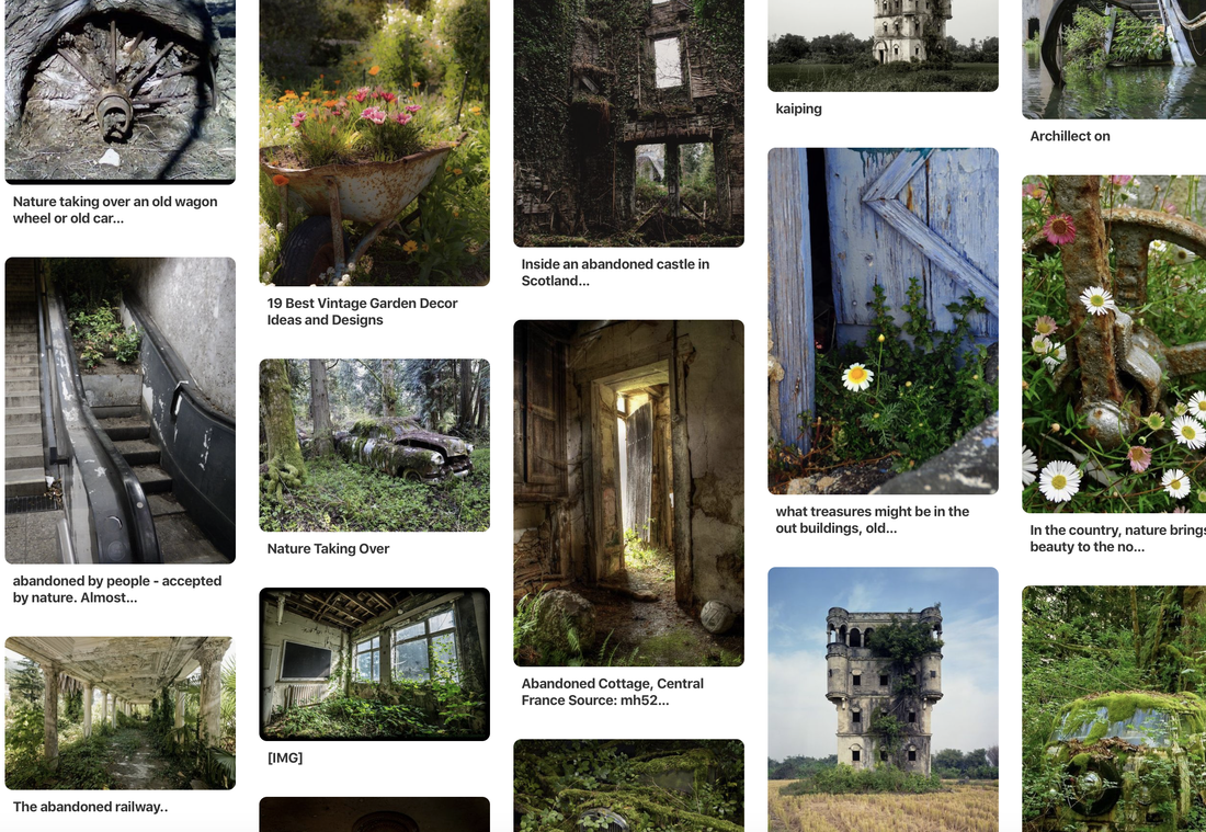
Nadav Kander - Chernobyl , Half Life
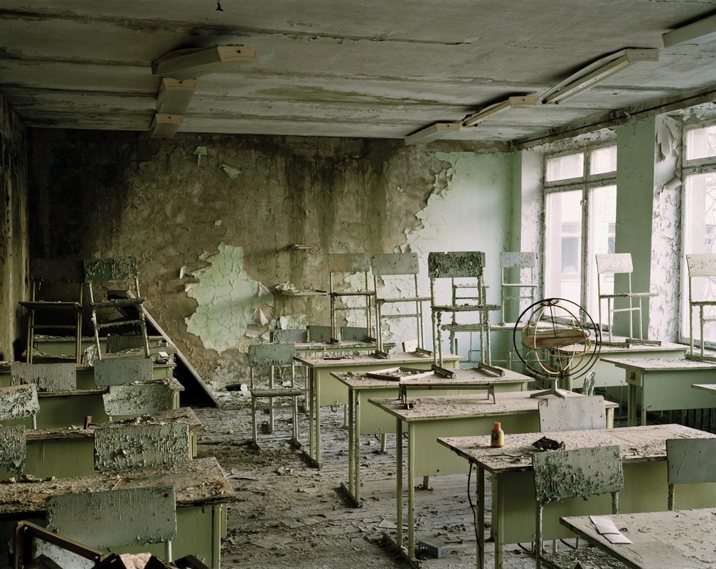
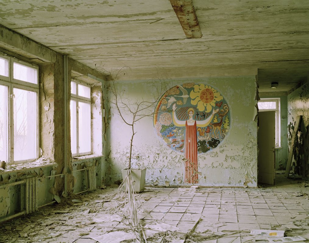
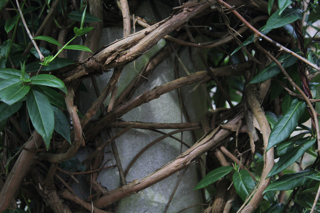
Half Life is a project where Nadav Kander took a series of photos in Chernobyl to show the effects after the nuclear power station exploded in 1986 leaving the city uninhabitable. Nadav Kander is considering the effects on the city, he shows this by focusing on damaged classrooms and buildings were people once lived. This task links to the theme of the force of nature because it shows how a desolate place over time has been overrun by the force of different plants, for example trees in the images below have forced their way through the floorboards. Nadav Kander wanted us to show what an impact nature has once humans have destroyed our surroundings. It shows that even though we have destroyed an area it doesn't mean that nature will stop growing.
|
|
|
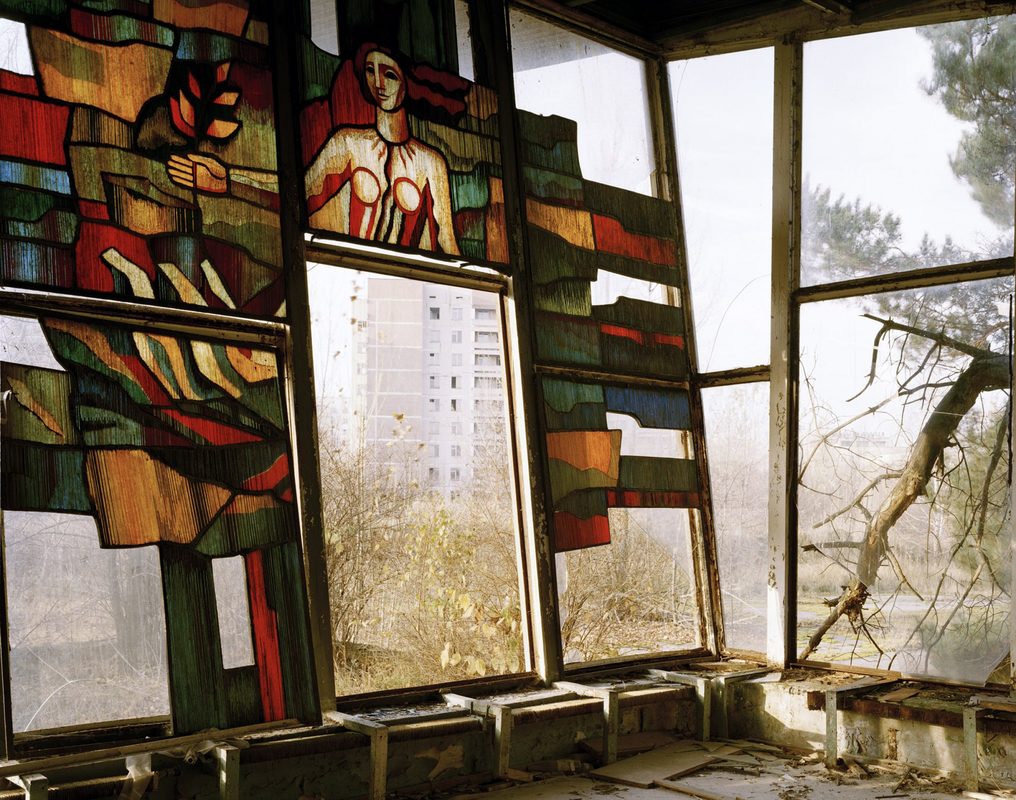
Nadav Kanders images are immediately shocking, they immediately show the reality of Chernobyl for people who would have never understood the damage. This image in particular caught my attention because I feel as though it has a really strong contrast within it. You have the painting on the back wall filled with colour that contrasts heavily with the broken down surroundings. I think this colour in the images highlights each and every crack even more, the cracks and peeling paper gives the image a very sinister feel yet it still shows the vibrancy of life before. The images overall show how once people are removed from society everything else too becomes lifeless.
|
Force of Nature:
In this task I was required to go and take photos showing the effect of nature and the force nature has on a location.
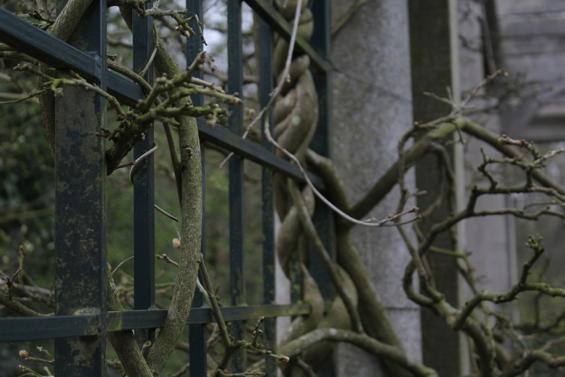
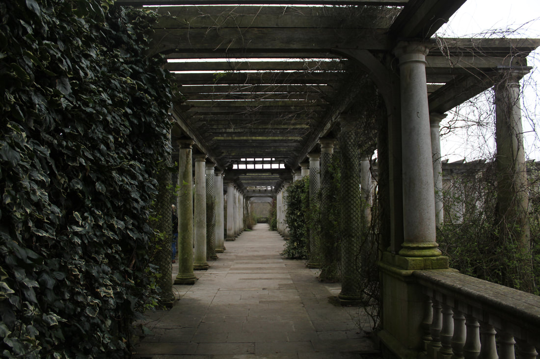
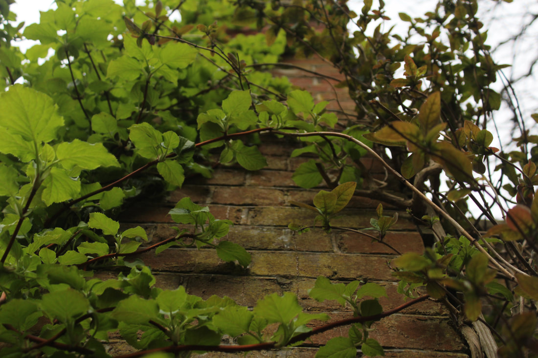
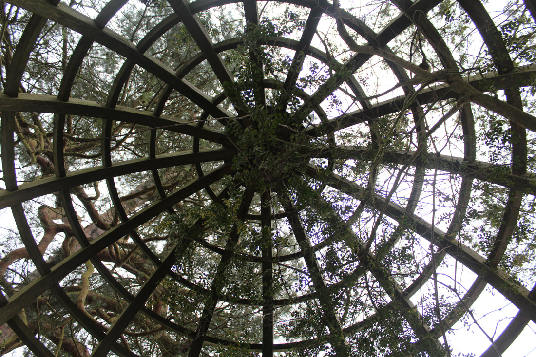
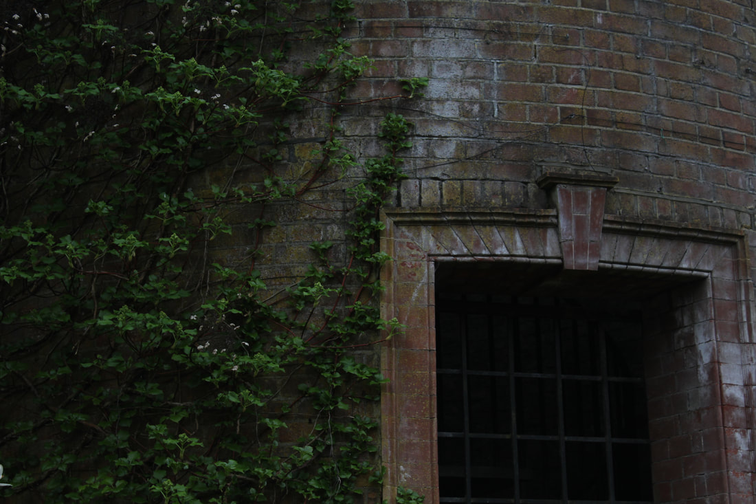
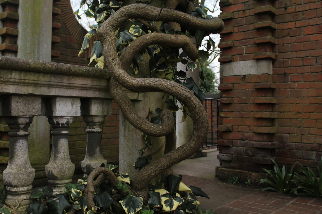
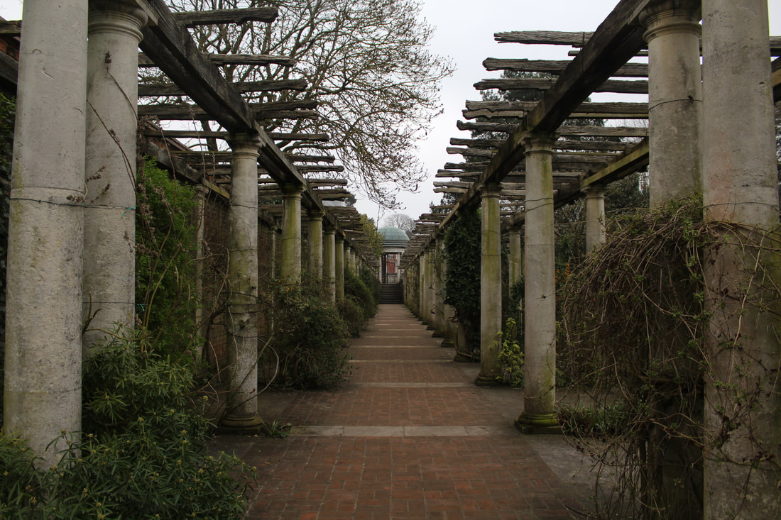
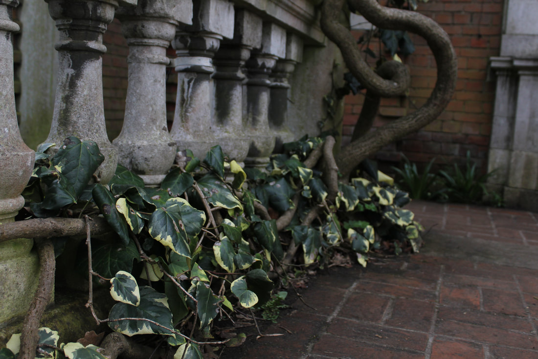
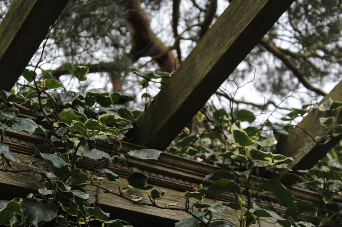
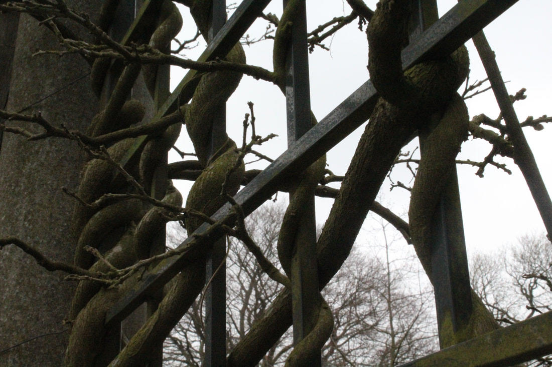
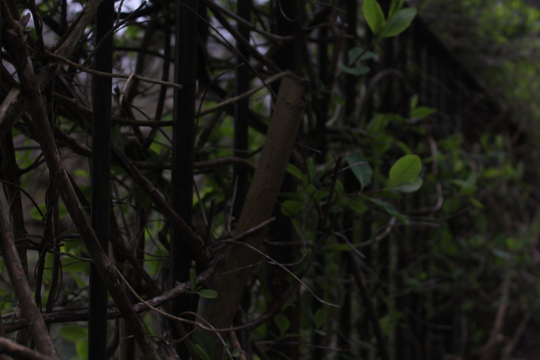
This task links to the theme of, Half Life, as it shows how abandoned spaces are taken over by nature which is similar to Chernobyl. Similarly in my images you can also see vines and trees taking over different parts of the abandoned building. I went to Golders Green park because they had a similar desolate building in the park which I think would given me the Man vs Nature theme much like Nadav Kander.
This task links to the theme of, Half Life, as it shows how abandoned spaces are taken over by nature which is similar to Chernobyl. Similarly in my images you can also see vines and trees taking over different parts of the abandoned building. I went to Golders Green park because they had a similar desolate building in the park which I think would given me the Man vs Nature theme much like Nadav Kander.
|
|
|
|
|
|
|
|
|
|
|
|
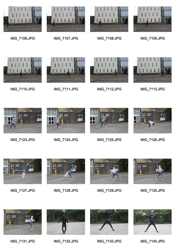
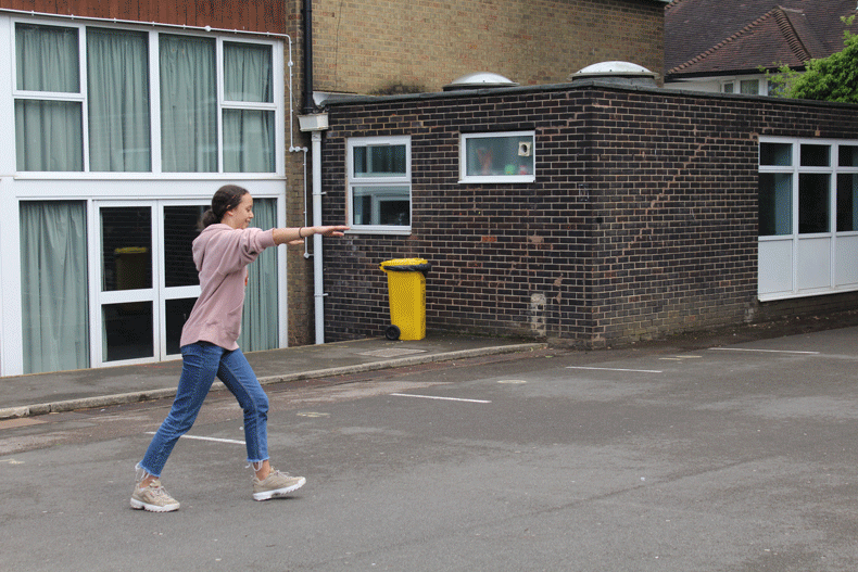
WWW-The subject I chose to photograph suited the theme as it was very overgrown and really showed the effect nature can have on buildings. My images express my intentions which were to capture different aspects of the force of nature in one location.
EBI- I could try going to a few different locations to show nature in other surroundings for example a coastal setting to show the force of the sea against land. I also took the photos on a day with not a lot of sunlight so the pictures came out darker, I could try photographing the same image at a different time of day.
EBI- I could try going to a few different locations to show nature in other surroundings for example a coastal setting to show the force of the sea against land. I also took the photos on a day with not a lot of sunlight so the pictures came out darker, I could try photographing the same image at a different time of day.
Artist and Me: Nadav Kander
Both images show the power of nature and how it forces itself through buildings and structures. Kander's image gives a more hopeful atmosphere as he included a bright image pasted on a wall. This gives two effects, one hopeful for the future and the other tragic as it shows how bright life used to be in Chernobyl. My image has a darker effect and almost looks quite gothic , there is nothing hopeful about the image and just portrays the eerie atmosphere on the day I went to photograph. Kander's image focuses mainly on a tree battling its way through the floor which shows the start of life whereas my image shows the sheer power as it almost consumes the building I was standing on.

|

|
Francois Delfosse
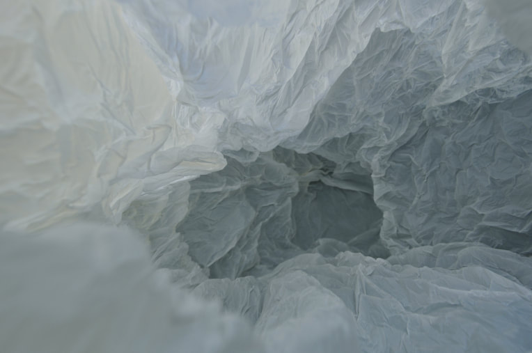
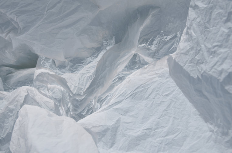
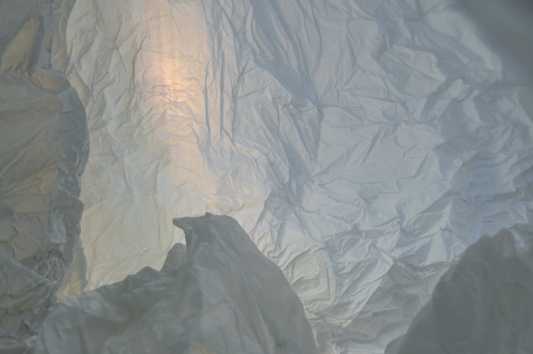
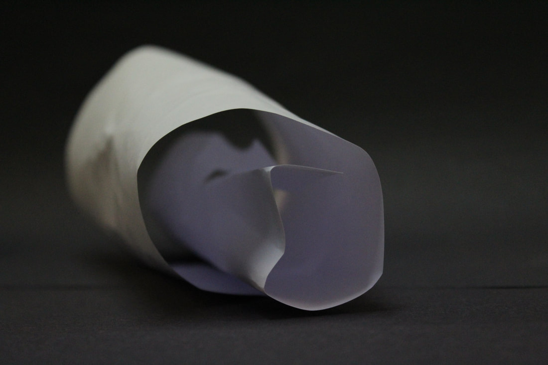
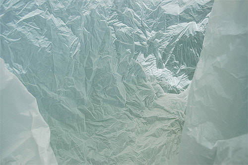
Francois was born Belgium and is a respected architect and photographer who is best known for his series of work 'Antartica in a bag' where he used plastic bags to replicate the setting of Antartica , because he is an architect his work shows how he captures the complex shapes within the bag. He tries to create depth in his images to allow the people viewing the image to have much more to look at than when they first encounter it. Delfosse creates surreal images . He does this by capturing all the different angles inside the plastic bag . He wanted us to look much deeper into the images and show how you can make a simple object seem so much more.
|
|
|
I really like this image because I think the light in the background helps to highlight all the shapes within the bag creating an artic landscape. The light in the back of the image creates more depth as the front of the image looks further away than it actually is. I think Delfosse wanted to show how an everyday object can seem like something so surreal and interesting. His images have a very peaceful and untouched atmosphere which represent the natural beauty of Antartica and the magical shapes the ice caves create naturally untouched my human life. I think his work shows how beautiful natural life is and shows a contrast with how now we can find natural beauty In even our everyday items.
|
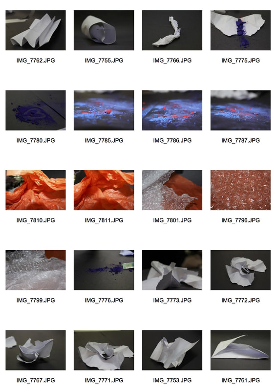
Applied Force
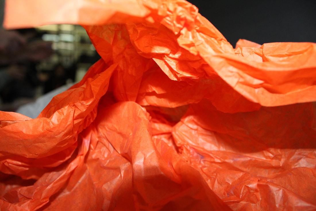
In this task I was required to take pictures of different objects after applying force to it. This task links to the work of Francois Delfosse where he uses plastic bags to create images that look similar to ice or a cave. My intention was to create images that weren't recognisable in their normal form but looked like something completely different, more surreal.
|
|
|
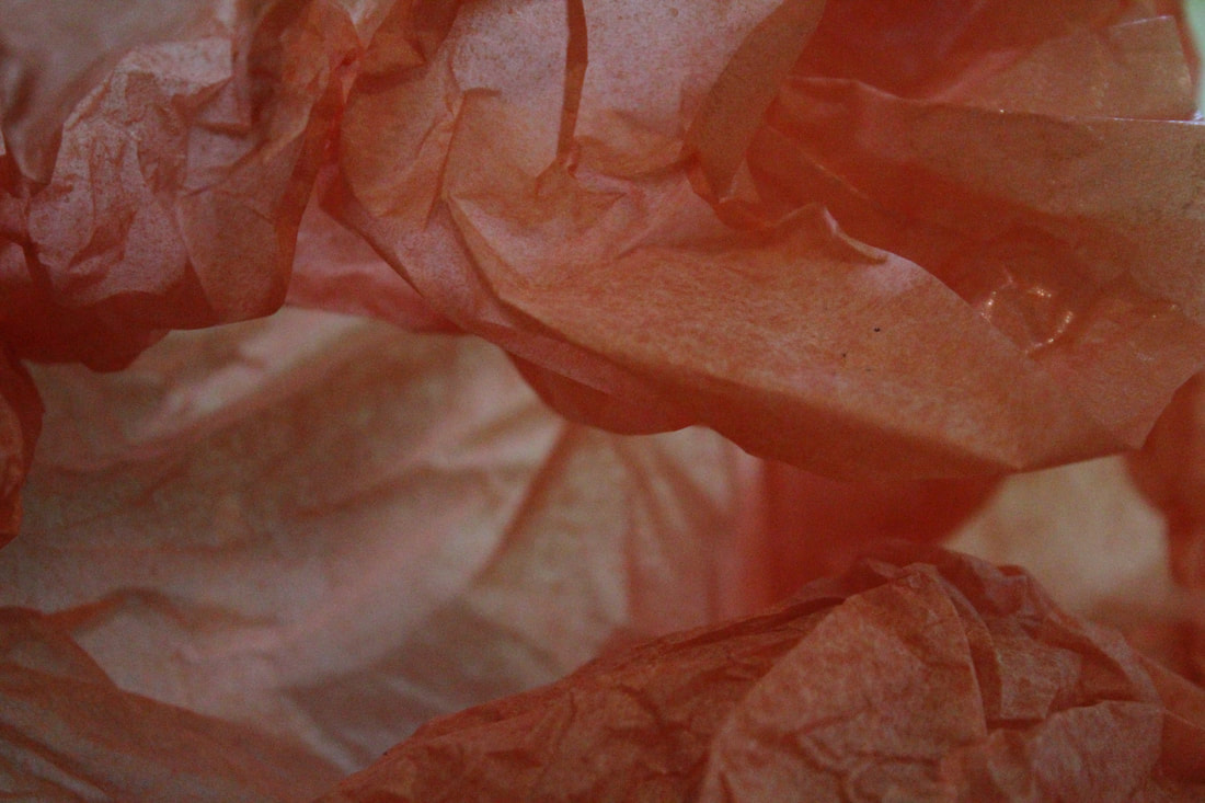
WWW- One of the subjects I chose to photograph suited the theme as the orange tissue paper also shows how you can change something to look like something else similar to the work of Francois Delfosse. I used a low F-stop which made the background more blurred which helped focus in on the main part of the image My images express my intentions which were to capture how you can manipulate objects to make them look completely different to their normal appearance.
EBI- Some of the subjects I chose to photograph did not necessarily fit the brief as it was not interesting enough. I feel that the plain white paper enable me to create an abstract image and it did not represent anything else. The concept wasn’t clear in my all images, I need to make it more explicit by keeping a theme through the photos as they all seem very different.
EBI- Some of the subjects I chose to photograph did not necessarily fit the brief as it was not interesting enough. I feel that the plain white paper enable me to create an abstract image and it did not represent anything else. The concept wasn’t clear in my all images, I need to make it more explicit by keeping a theme through the photos as they all seem very different.
Homework
In my second response to this task I wanted to make my images more abstract and interesting to look at. This response again links to the work of Francois Delfosse as I wanted to focus more on plastic bags and paper much like his work.
|
|

|
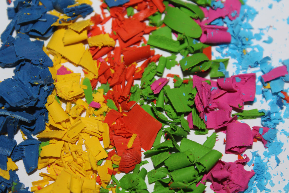
WWW- The subject I chose to photograph suited the theme as it captures how different objects look when force is applied. I used a flash in some of the images to capture the different colours of the crayons.
EBI- Some of the images are quite dark so next time I could make my iso higher or go to a different location with more natural light to help capture the different levels on the image. I could experiment with different colour of bags to help make the images look lighter and to help capture the depth of the image.
EBI- Some of the images are quite dark so next time I could make my iso higher or go to a different location with more natural light to help capture the different levels on the image. I could experiment with different colour of bags to help make the images look lighter and to help capture the depth of the image.
Artist and Me
This is an image from Francois Delfosse's work ' Antarctica in a bag'. He uses a plastic bag and photographs the inside to create this interesting image which replicates the setting of Antarctica. His images start of lighter around the edges but get darker as the image gets deeper which makes the images look more realistic as Antarctica.
|
This is my take on Francois' work, I wanted to use coloured bags to create a different feel for my images. I used a lower exposure to make my images darker so you can see all the shapes in the plastic. I think my image shows how I was inspired by his work to create my own style of his concept as I tried to play around with different materials and colours to create varied effects.
|
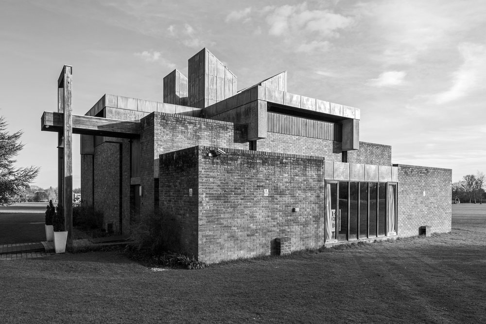
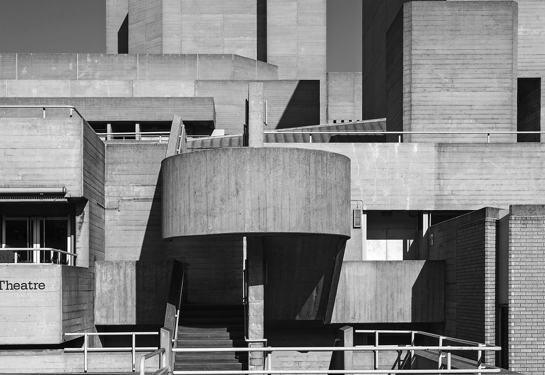
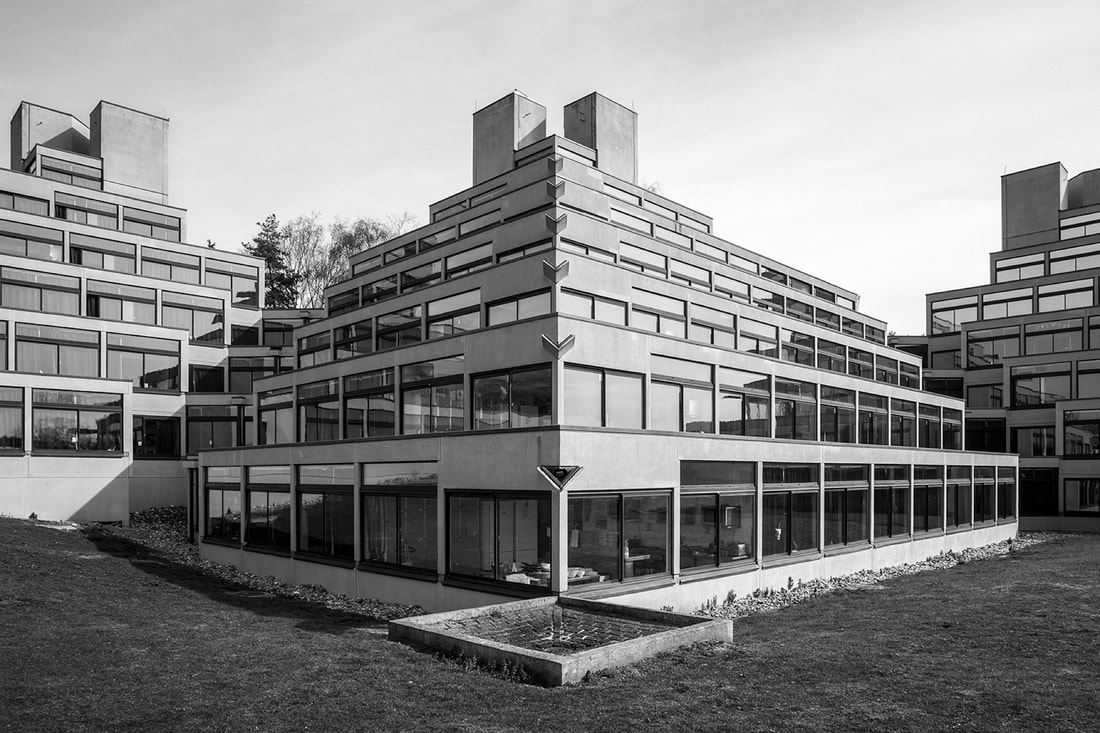
Simon Phipps
Simon Phipps is a fine arts photographer and focuses some of his work on architecture around brutalist buildings. He captures hard lines and different shapes of buildings to create his images. He focuses on the different materials and shapes to makes us question the purpose of the building and how they were made. He edits all his images into black and white maybe to help us to fully appreciate the structures without distraction of the surroundings or maybe to create more dramatic compositions. He wanted us to consider the ways in which buildings are built and how some are made for practical purposes and some are made for statement purposes. We can then fully understand why archictecture is so important and impactful to the culture of a society throughout different time periods.
|
|
|
This image is one of my favourites because of the symmetry, at a first look it seems as though the image has been mirrored because each side is almost identical. Phipps calls his work 'brute beauty' and I think this is a perfect description for his work as the structures he uses aren't usually described as beautiful as they have such harsh lines. However his images make them seem interesting and give them a lot more character. I think Phipp's work show how human creations should be appreciated and that we ignore some of the work and effort put into brutalist architecture. Phipps allows the viewer to once appreciate the building no matter of its background.
|
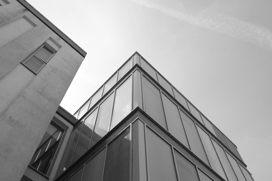
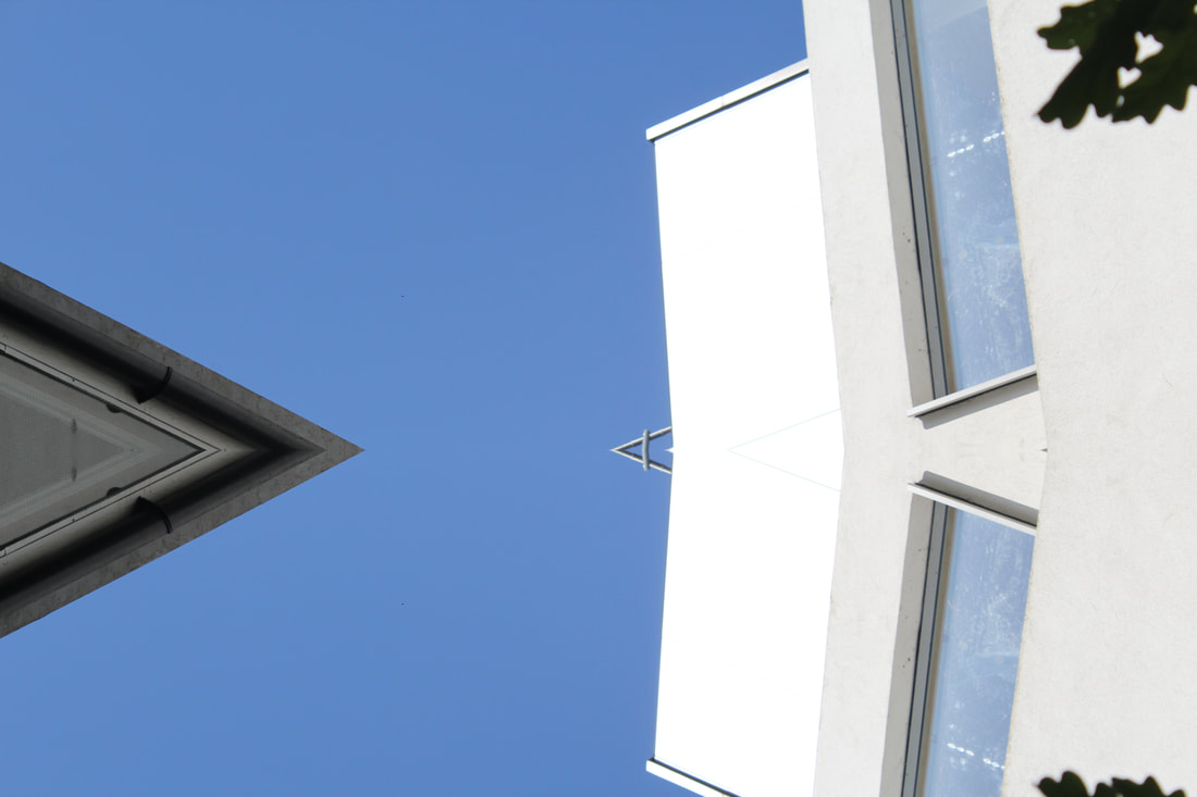
Architecture force
In this task I was required to show how using ideas such as form/shape, negative space, line and perspective can change images of architecture. This task links to Simon Phipps who uses these ideas to capture the shapes of buildings. My intention was to explore different shapes of buildings and ways to capture them interestingly.

Form/Shape/Line
|

Negative Space
|

Line/Perspective
|
WWW- The subject I chose to photograph suited the theme as it had lots of different angles that showed the building in interesting ways. My ISO settings were high so when I made the pictures black and white they didn't look too dark by making the pictures black and white I think it helped focus on the shapes of the architecture. My images express my intentions which were to capture new perspectives of buildings.
EBI- Next time I should go to a another location to get more varied images. I also need to make each idea more explicit as I think form/shape and negative space pictures look quite similar.
EBI- Next time I should go to a another location to get more varied images. I also need to make each idea more explicit as I think form/shape and negative space pictures look quite similar.
Artist and Me: Simon Phipps
I felt that me and Phipps created similar effects in these two images, they both use the triangle like shapes in buildings as the focal point of the image. Phipps' image is more intriguing as the building has so many windows and layers to it whereas the building I photographed had a more basic structure. The images are also from different angles, mine is from below and explores the height of the building whereas Phipps' is from front on and explores the depth of the building. I think both images demonstrate brutalist architecture styles and show how intriguing they can be to the viewer.

|
|
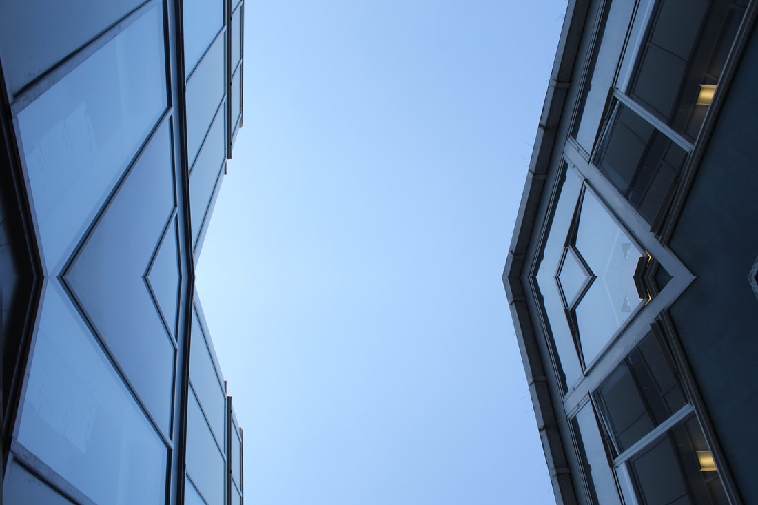
2nd Response
In my second response of this task I wanted to focus even more on the form, negative space and perspective to allow the shapes of the structures to be highlighted and to draw the viewer to specific focal point of the image. Last time I felt as though my images were explicit enough and didn't fully represent the style of Simon Phipps work so thats what I want to improve on this time.

Line and perspective
|

Form/shape/line
|

Negative space
|
WWW- The subject I chose to photograph suited the theme as it had interesting shapes within the building. My images express my intentions which were to capture different angles of one building and to create a more brutalist style. I like how putting the pictures in black and white helps make the harsh lines stand out.
EBI- Some of the images are quite dark when they are put into black and white so next time I should take photos at a different time of day or make my iso settings higher.
EBI- Some of the images are quite dark when they are put into black and white so next time I should take photos at a different time of day or make my iso settings higher.
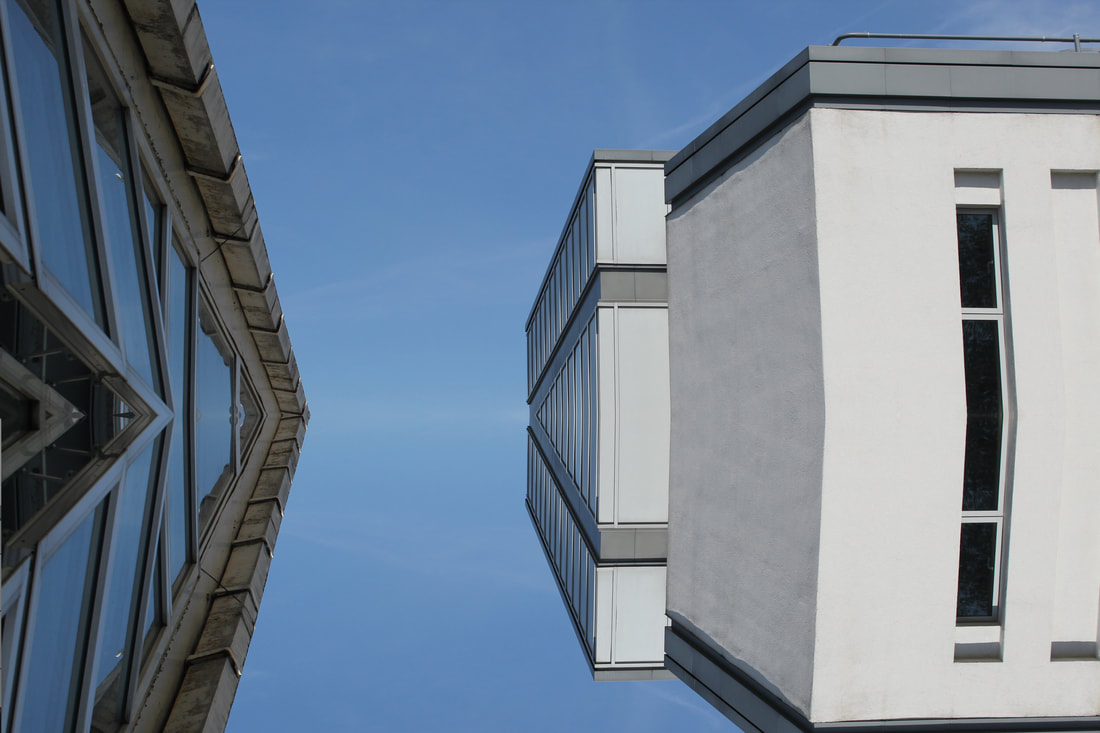
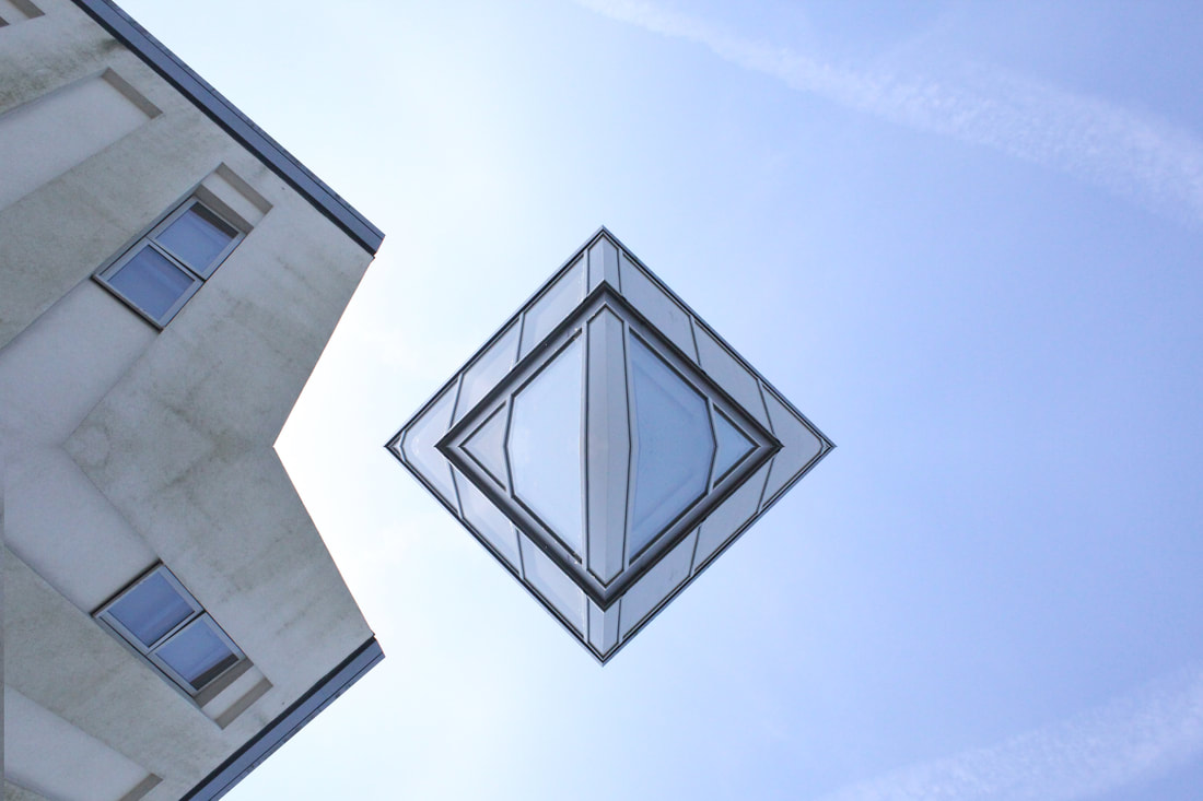
Extension - Reflected Architecture
In this task I took my images from earlier and flipped them in photoshop to create these abstract compositions.
|
|
|
|
WWW- i think i reflected the images well to create some new interesting shapes and to create a surreal composition. The images I used had very rectangular buildings which formed some new shapes making the buildings look unrecognisable.
EBI- If I wanted to continue developing this strand then I could go to different locations with varied architectural structures to avoid each composition looking very familiar. I could also try mirroring whole buildings so the background of each image was clear in the images.
EBI- If I wanted to continue developing this strand then I could go to different locations with varied architectural structures to avoid each composition looking very familiar. I could also try mirroring whole buildings so the background of each image was clear in the images.
Homework
In this task I was required to continue to photograph buildings focusing on the criteria : perspective, shape and negative space. This task links to the theme of architecutral force as it shows how brutalist buildings have a dramatic effect of the environment around them. My intention was to respond to Simon Phipps because I wanted to explore the way he photographs buildings to make dramatic compositions.

|

|

|
WWW-My composition helped to support my response to the theme as each image shows one of the ideas of perspective, form/shape and negative space. I kept the shutter speed quick so it would capture the buildings clearly and would be easier to get a not blurred photo.
EBI- My images do not show all my intentions which were to also show negative space, the places I chose to photograph made it hard to get a clear photo that showed negative space. Next time I will go to a location where my building is in a clear space. Additionally in Alexandra Palace it was difficult to move around the building and photography different angles.
EBI- My images do not show all my intentions which were to also show negative space, the places I chose to photograph made it hard to get a clear photo that showed negative space. Next time I will go to a location where my building is in a clear space. Additionally in Alexandra Palace it was difficult to move around the building and photography different angles.
Force of Movement
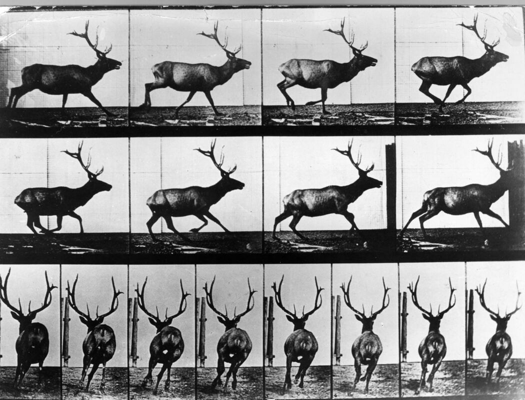
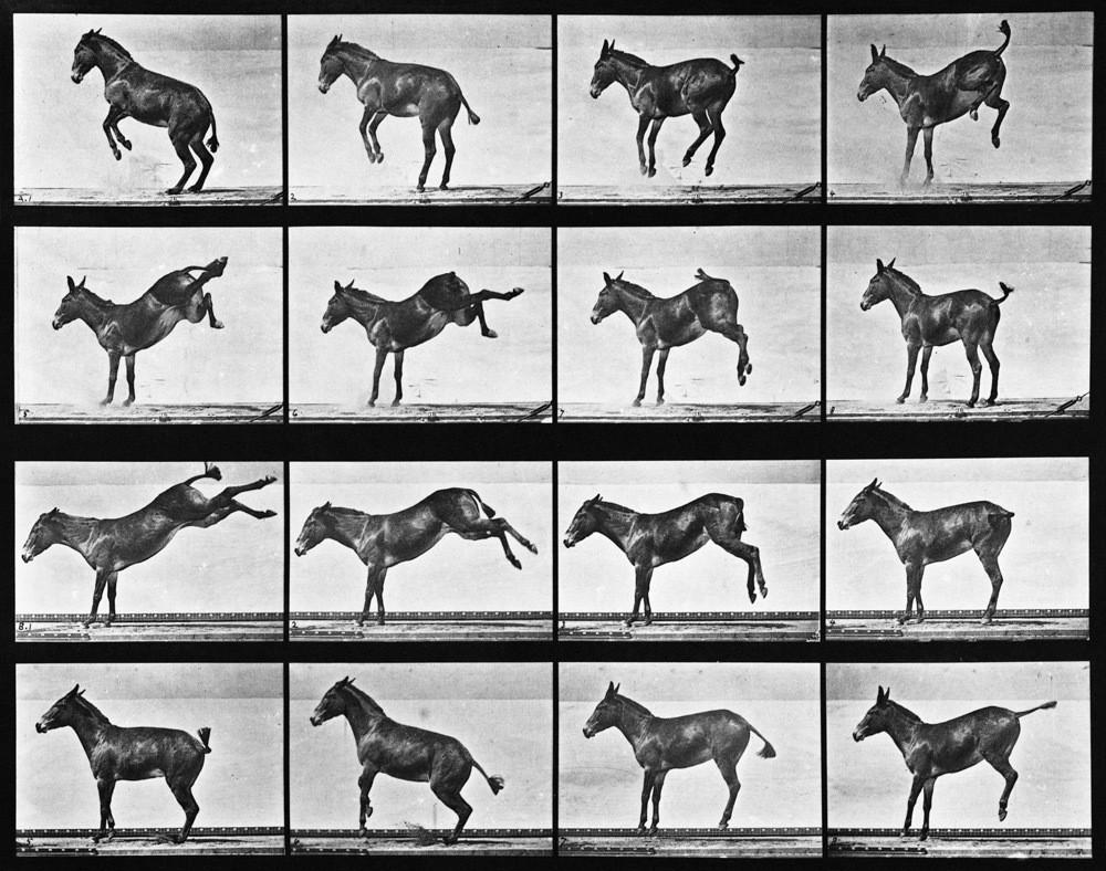
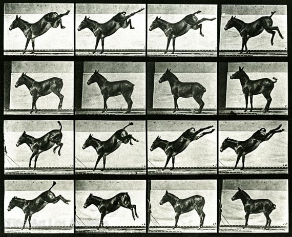
Edward Mybridge
Eadweard Muybridge was an English photographer, who emigrated to the United States in the 1850's, important for his work in studies of motion, and early work in motion-picture. He takes images go moving people and mainly horses to show their profession of movement. His work is placed into a series of around 16 images all taken whilst the subject was moving to capture it in time. At the time he took his images in the 1850's his work used the latest technology to show how a horse lifts all four hooves off the ground at one point whilst running something which no-one at the time had seen before as the movement was to quick for the eye to distinguish. He pushed the limits of the technology at the time creating world famous images of animals in motion.
|
|
|
Considering the time in which Mybridge took his photos they were really influential in the photography technology. This image is laid out so you can see each movement of the horse, his image not only was good photography but allowed people to learn more about animals in motion, something which our eyes can't do by themselves. He also created his images into gifs alongside the stills to show how the movement was captured.
|
First Response
In this task I was required to take images of of people moving and create a finished piece in either a Gif or an edited picture similar to Edward Mybridge.
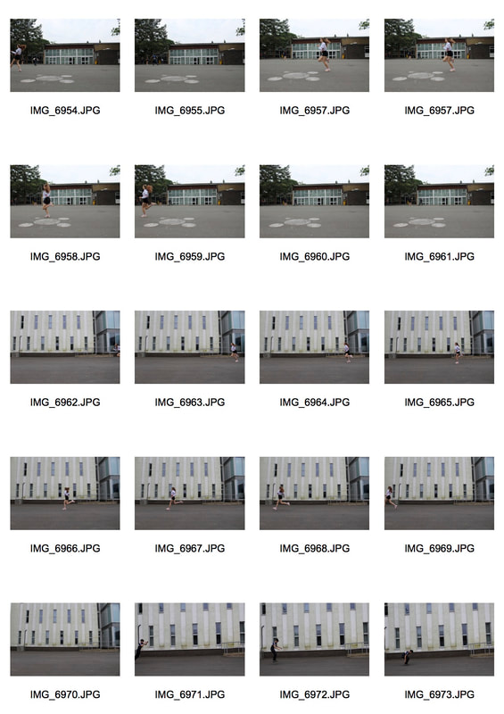
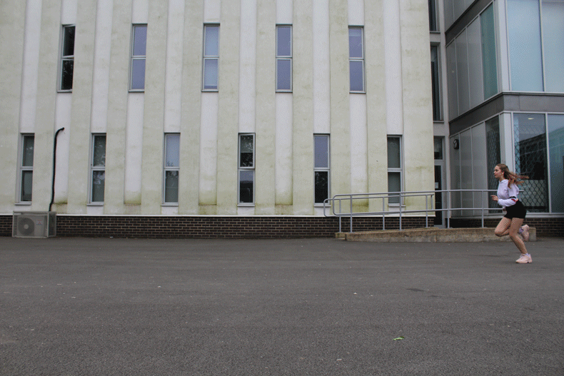
WWW- I think I managed my shutter speed well as it captured enough of the movement so I could make a gif. I also think the Gif flows well and like Mybridge shows each progression in the movement.
EBI- I didn't use a tripod which resulted in the camera shaking so makes the gif background move which I feel takes away from the actually running itself. Next time I want to try different movements that will create a more interesting gif and I will prioritise making sure my camera doesn't shake by using a tripod.
EBI- I didn't use a tripod which resulted in the camera shaking so makes the gif background move which I feel takes away from the actually running itself. Next time I want to try different movements that will create a more interesting gif and I will prioritise making sure my camera doesn't shake by using a tripod.
Second Response

|
|
WWW- I think my second response was more effective than my first. I like my still image and I definitely would want to continue this for one of my strands. My gif is also better as I feel the image flows better and my camera shakes less.
EBI- I think if I could've taken more time on my still image to make sure I cut out each image more precisely as if you look closely there are bits that aren't cut and blended properly. Next time I want to create shadows and blend the hands and feet properly into the background.
EBI- I think if I could've taken more time on my still image to make sure I cut out each image more precisely as if you look closely there are bits that aren't cut and blended properly. Next time I want to create shadows and blend the hands and feet properly into the background.
Water-Balloon Force
In this task we were required to take pictures of a ballon as it was being popped to capture the shape of the water. For this you need to have it on sport mode or a quick shutter speed and continuous shooting to be able to capture it clearly.
Edward Horsford
Edward focuses his work around his design work as he designs innovative technology all designed by him and the people he works with . Edwards work shows high-speed shots of water balloons at the point of bursting. A series of experiments investigating how everyday objects look at high-speed. This definitely reflects his design work as he takes images of everyday objects and technology which links to his creativity around creating useful technology.
|
|

|
I think this image is one of his most effective ones. I like the way the string and hand are completely still whilst the balloon is popping. This image is really eye-catching because it is something impossible to capture with our own eyes. I also think the contrast between the water and the green background makes the shape of the water clearer. Horsford really captured a split second in an image and it is quite surreal for people to look at as for our eyes the image would be impossible to see.
|
Response
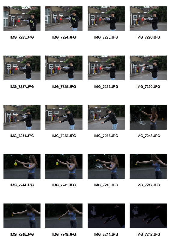
WWW- I think the pictures captured the water clearly in each photo and I was able to capture interesting shapes that the water created.
EBI- next time I think I should go in closer because when I zoomed in on the photos it became a bit blurred, also some of the pictures are quite dark so I should've made my ISO settings higher. I also should've put my camera on a quicker shutter speed because I missed the popping of the balloon in some of my images.
EBI- next time I think I should go in closer because when I zoomed in on the photos it became a bit blurred, also some of the pictures are quite dark so I should've made my ISO settings higher. I also should've put my camera on a quicker shutter speed because I missed the popping of the balloon in some of my images.
Exhibition - FOAM , Amsterdam
In the Christmas holidays I went to Amsterdam , whilst I was there I visited a photography museum called Foam. The exhibition that was showcasing at the time was called 'Feast for the Eyes'. The exhibition explores how food is represented across three themes. For Still Life one of the most popular show how artists have been inspired by the genre and how it has changed in the course of time. Around the Table looks at the culture that takes place around food. In addition, this section also deals with cultural identity that is in food. Finally, Playing with Food shows the fun side of food photography alongside images of old cookbooks that give context and show the development of food over time.
Here are some of my favourite artists from the exhibiton:
Here are some of my favourite artists from the exhibiton:
Laura Letinsky- Still Life section:

|
This image I think captures the aftermath of food really well, its not something that many artists choose to photograph as it isn't seen as very 'asthecially pleasing" . However I think Letinsky manages to make her images intriguing. The light colours of the background and wall help to make the orange peel stand out more and become the focal point of the image. I think this is a common theme that runs throughout her images where she keeps a very plain background which allows the food in the image to become the focus. |

|
This image again really stands out for me as I think it is a good representation of a twist on still life images. I think the way she has arranged her objects seem natural. However at further glance you notice the cup leaning on the side and then the dirty table cloth. I feel that her images at first seem very normal but when you look deeper there is much more to the image. |
JR - Around the table section:
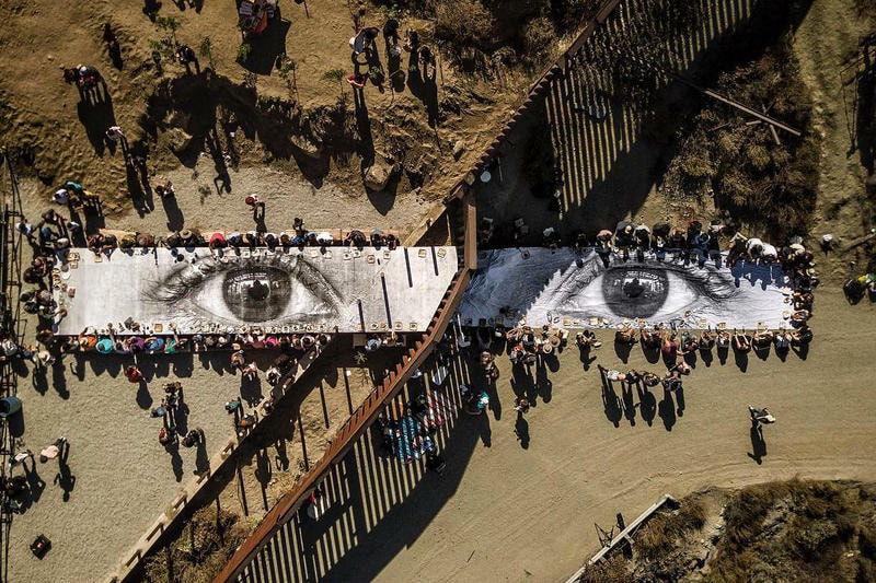
|
This was probably my favourite image from the whole exhibition as I feel as though the context around the image was just as intriguing as the image itself. The photo captures a giant picnic along the Mexican border, on one side people are at a table whereas on the other they are sitting on the floor. This is because this project was actually illegal on the US side so they couldn't have a proper table. I think the most striking this is that everyone in this image is drinking the same water, sharing the same food and enjoying the same music. The image captures how the wall was forgotten about for a moment in time and that every body should be treated as equals.
|
STRANDS
Force of an object - Strand 1
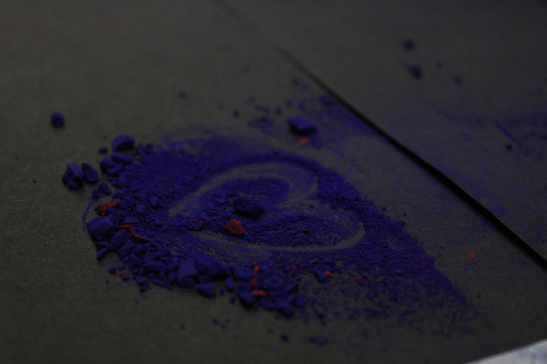
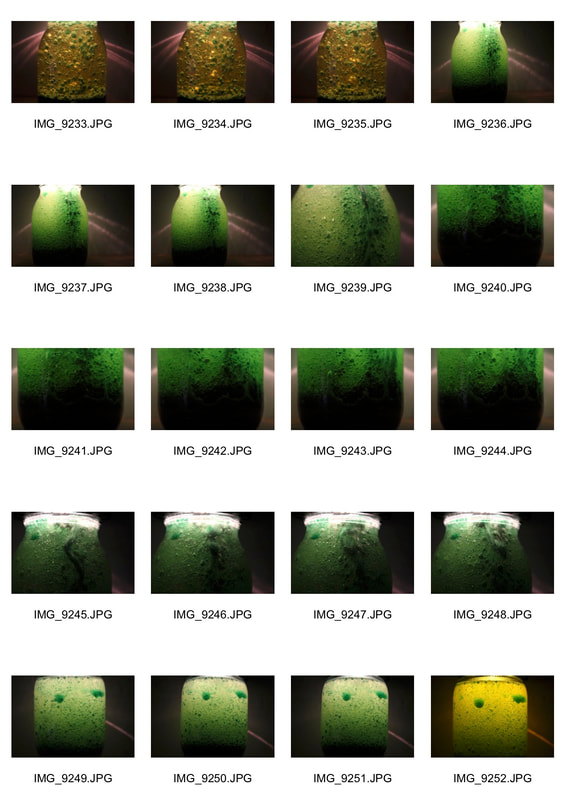
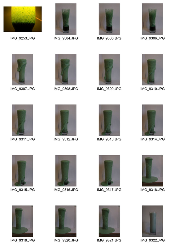
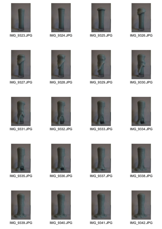
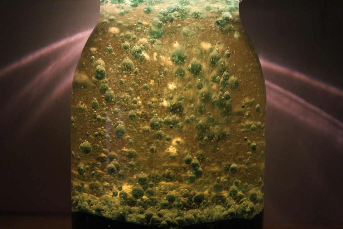
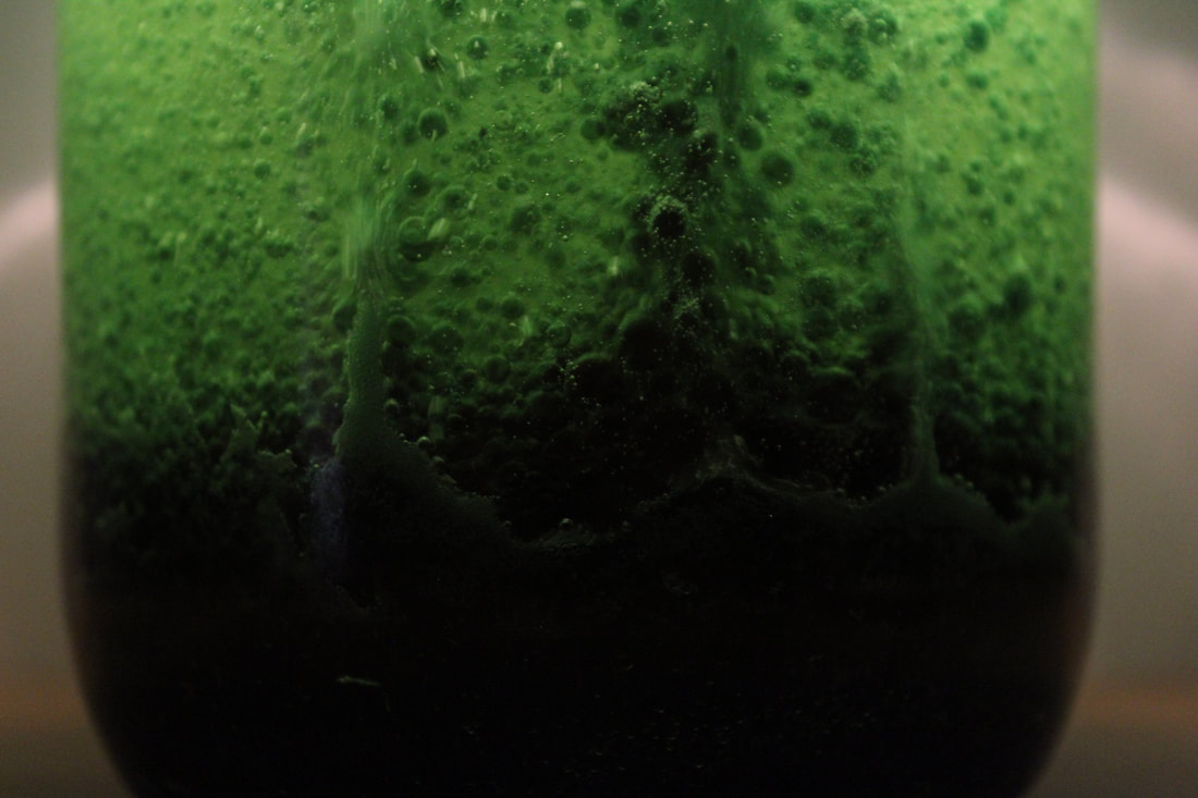
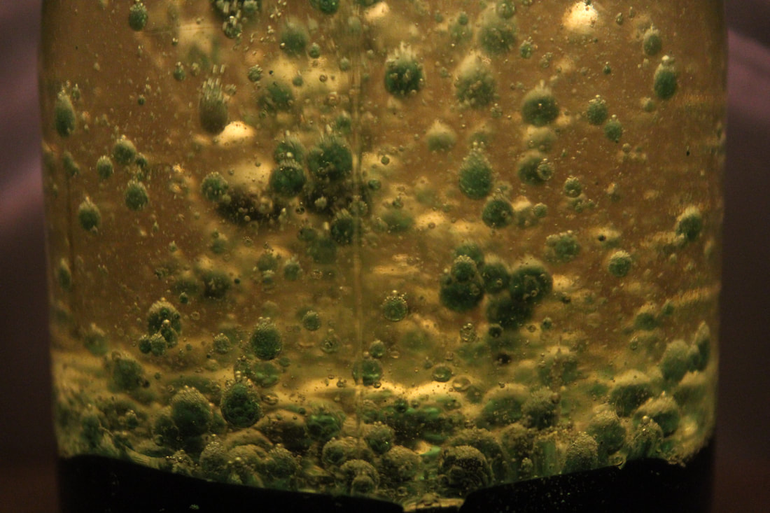
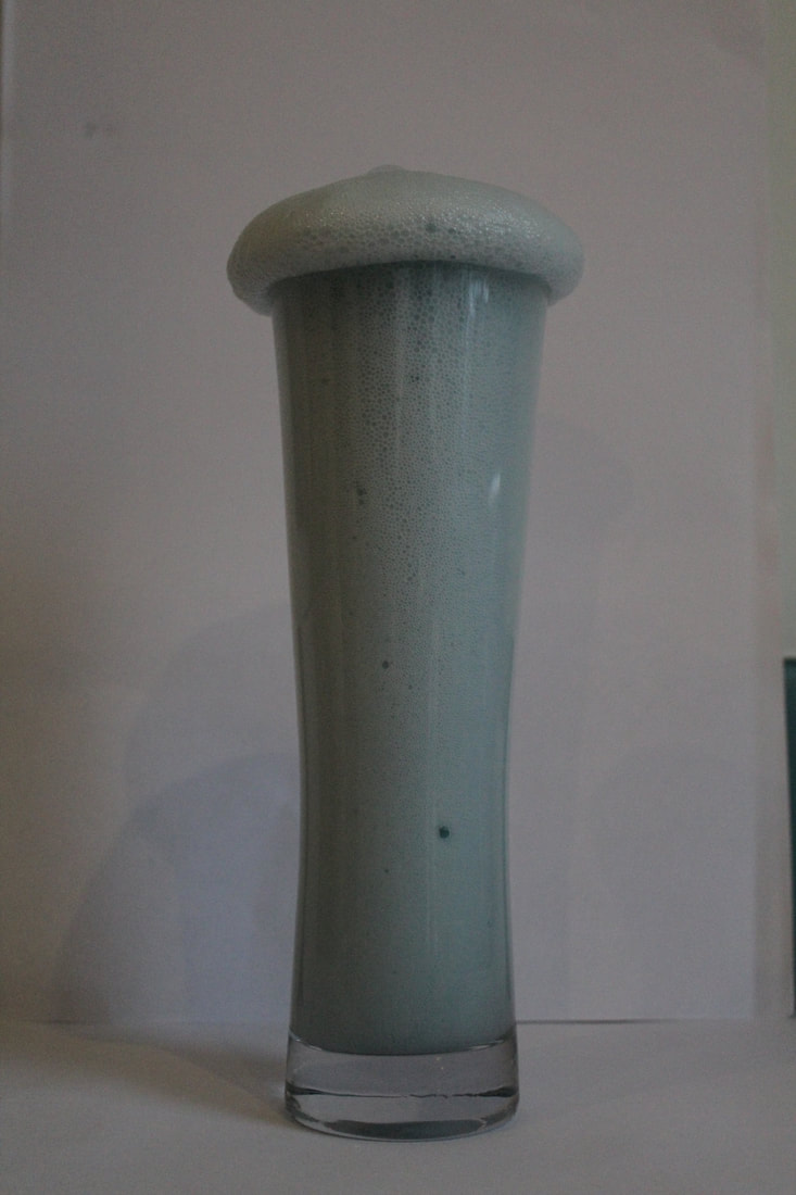
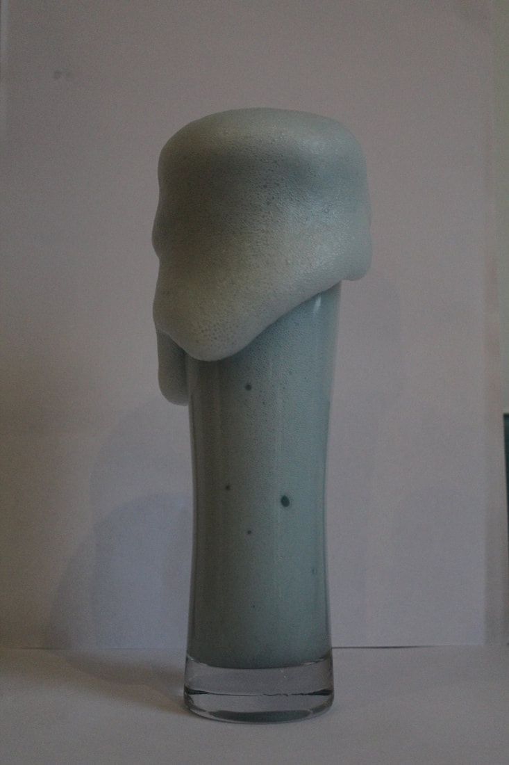
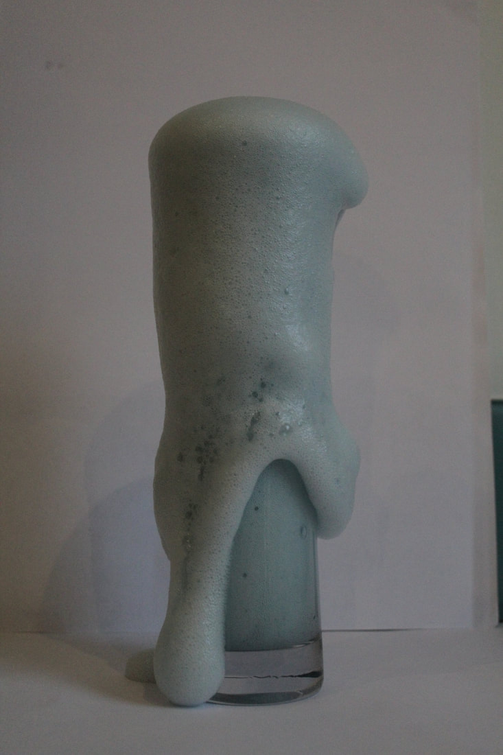
In this strand i wanted to focus on capturing force within an object. I first photographed an experiment with vinegar and baking soda and then capturing the chemical reaction that followed. I used a quick shutter speed and a tripod to ensure I captured each change as the reaction built up within the glass. Secondly I photographed a lava lamp I attempted to make. However this time my focus was more on maintaining my iso and a dark background to allow the bubbles in the lava lamp to be showed clearly.
|
|
|
|
|
|
|
|
|
WWW- I really liked how my images of the lava lamp worked as I think the bubbles create really interesting shapes and make my images more abstract. I also think my images of the reaction in glass worked well and I like how I decided to colour the vinegar so it made the shapes seem more interesting.
EBI- I think next time I should take more continuous images of different reactions so I can take them into gifs. I also want to photograph them next time in a plain background so the images don't get distracted by shows in the background.
EBI- I think next time I should take more continuous images of different reactions so I can take them into gifs. I also want to photograph them next time in a plain background so the images don't get distracted by shows in the background.
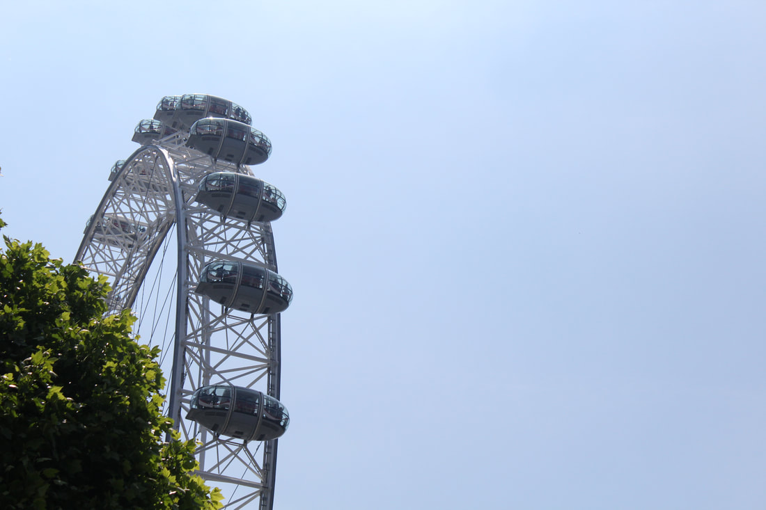
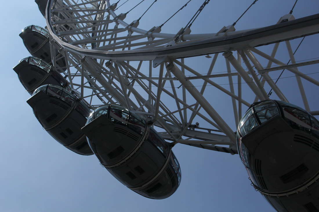
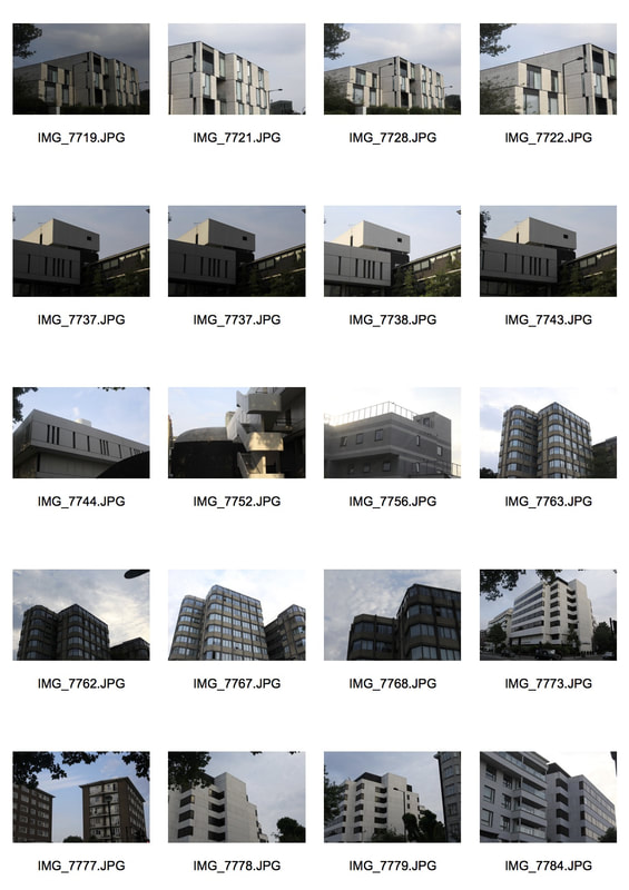
Architecture-Strand 2
In this Strand I wanted to take images of different structures to create compositions that show varied from of architecture. This strand links to the theme of brutalist architecture and I wanted to link my work further to artists such as Alexey Bogolepov which you can see my take on below. For my development I went down to the The Thames near the London Eye to capture images of the skyline and buildings surrounding the London Eye, the day I photographed was very sunny which helped to bring out every detail in my images. I also went to photograph near The Gherkin because I felt it would give me more modern buildings so I could have some contrasts in differently built structures.

|
|
|
|

|
WWW-My composition helped to support my response to the theme as where I chose to photograph had lots of different shapes and space to take pictures from different angles. The weather that day and the bright sunlight really helped create shadow and a clear background to highlight the shapes.
EBI- I think the images are quite similar so next time I should try some different locations to get a range of pictures. It would be good to experiment on a day with different weather to see what images I could produce.
EBI- I think the images are quite similar so next time I should try some different locations to get a range of pictures. It would be good to experiment on a day with different weather to see what images I could produce.
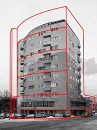
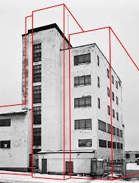
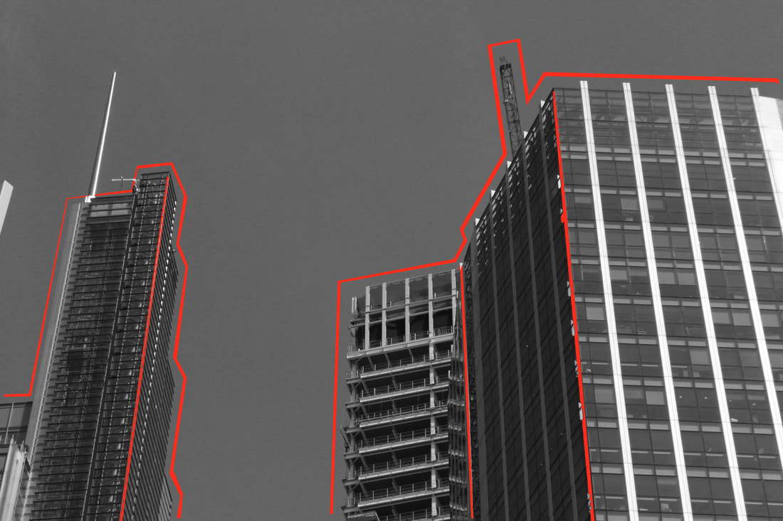
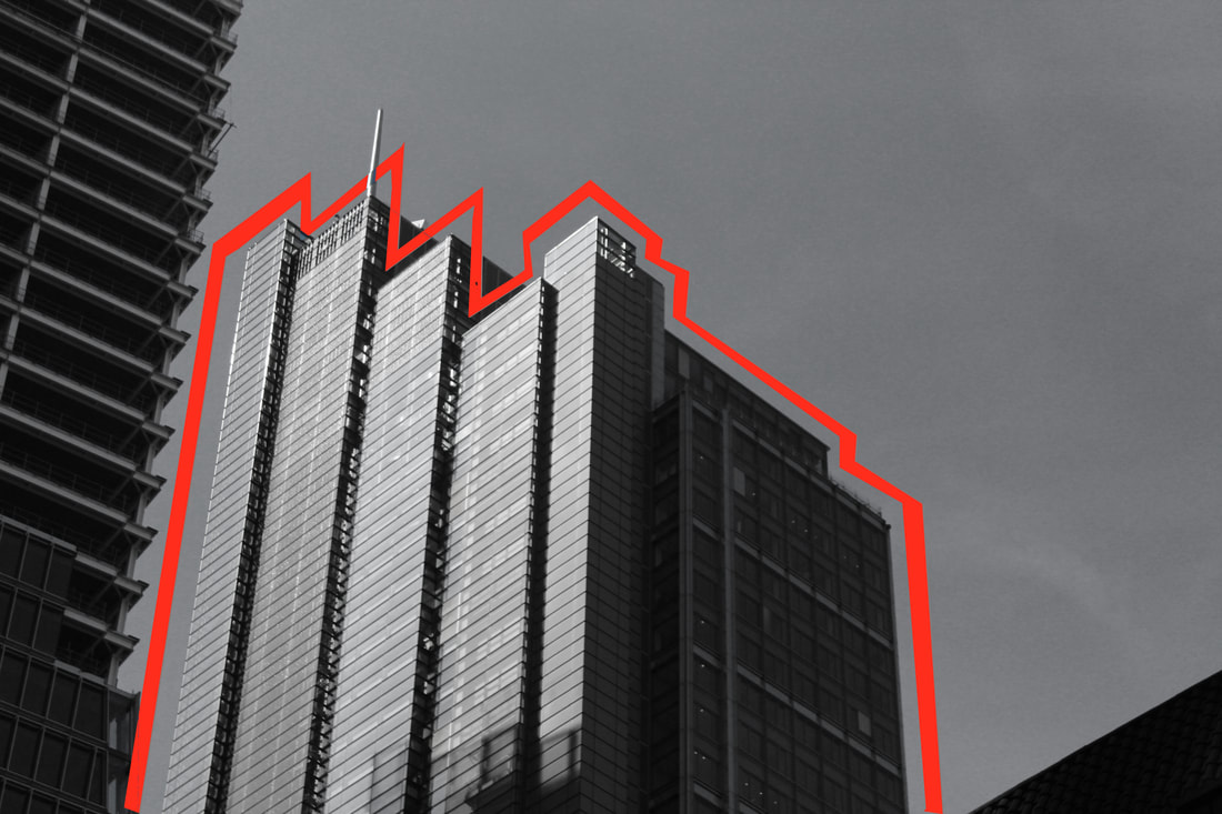
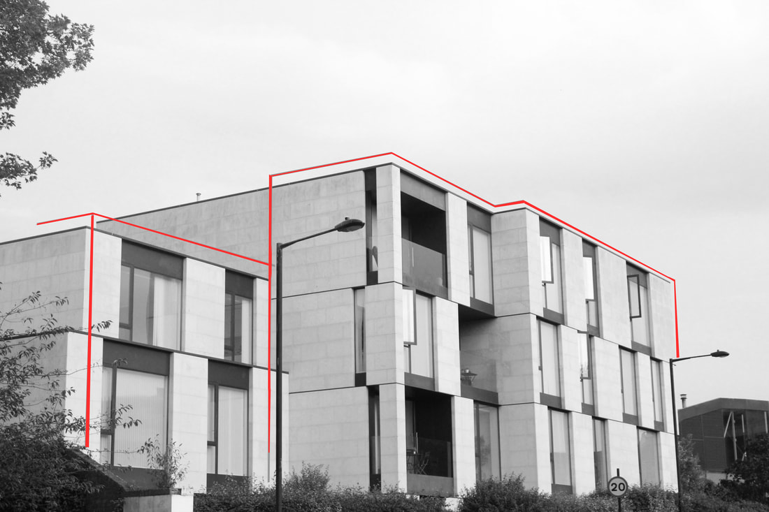
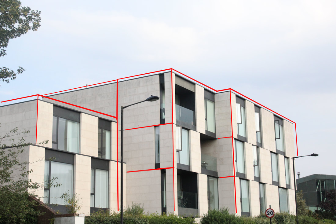
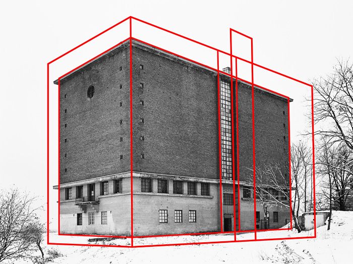
ARTIST-Alexey Bogolepov
Alexey is a 29 year-old Russian photographer currently based in Saint Petersburg. For his series BLOC, Alexey photographed a series of austere buildings constructed in Saint Petersburg during the Soviet era. Alexey's work is influenced by the growth in modernisation in its architectural and psychological expressions. In his process of creating BLOC he researched his buildings via guidebooks for local architecture, he said ' I waited for days for even lighting and cloud cover and then I photographed them on medium format Illford film'.
|
|

|
|
|
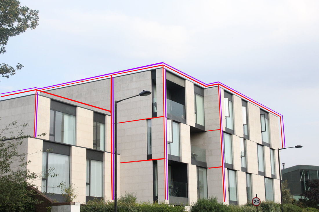
WWW- the images have interesting shapes so I think adding the red lines highlighted their shapes even more. I also think putting them in black and white helps make the lines stand out even more against the building.
EBI- the lines become uneven in the images so next time I think I need to go over the lines so they are more symmetrical. I also think I should add more red lines on the actual building like the outline so it seems more 3D
EBI- the lines become uneven in the images so next time I think I need to go over the lines so they are more symmetrical. I also think I should add more red lines on the actual building like the outline so it seems more 3D
|
|
|
WWW- I like how I start to add different coloured lines in on the building and I think this is something that I would continue successfully. I also think making the lines thinner in these images helped show the shape of the building more.
EBI- Next time I should try different lines and colours to help the lines stand out as I feel they get lost in the image. I would also like to experiment with different building shapes.
EBI- Next time I should try different lines and colours to help the lines stand out as I feel they get lost in the image. I would also like to experiment with different building shapes.
Artist and Me: Alexey Bogolepov
Both mine and Bogolepov's work outline buildings to show their unique structure and shape. Bogolepov decided to go for one stand out red line which acts as a strong contrast to the black and white background building, whereas I decided to do two contrasting lines against the background. I think making the image black and white helps outline the shapes of the buildings more snd creates a stronger contrast.
|

|
Movement-Strand 3 (developed strand)
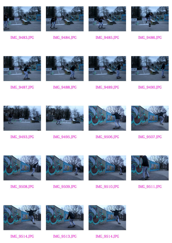
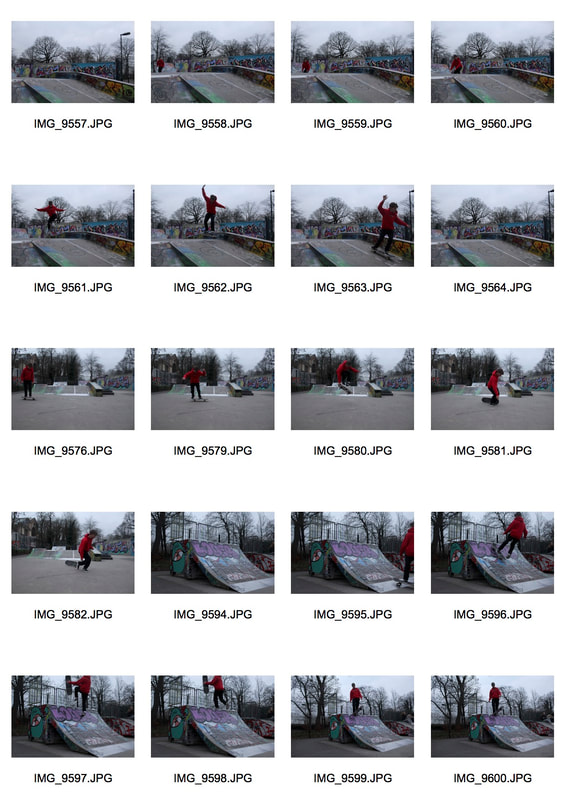
In this strand I wanted to continue developing my previous work around Edward Mybridge. These images link to the theme of Movement and capturing movement in a very different way to show the progression of, in my case, the skateboarder. I decided to first develop using skateboarding as I feel you get a clear change in height and positions as you follow the movement. I wanted to take pictures of tricks that gained height so each still showed a very different position. I photographed my subject the quickest shutter speed which was 1/3500 so I could get each and every movement.


WWW- I think the edits of the images flow well and works well together and because I used a quick shutter speed and continuous shooting the images captured the movement well and clearly.
EBI- Next time I think I should try to get more height from the skateboard so the change in movement can be more dramatic. The background is also very busy which I think distracts from the actual movement itself. Next time I would like to go to a skate park so the background relates more to my image.
EBI- Next time I think I should try to get more height from the skateboard so the change in movement can be more dramatic. The background is also very busy which I think distracts from the actual movement itself. Next time I would like to go to a skate park so the background relates more to my image.
How i did it-
Development of strand 2
I chose to develop this strand because I really liked how my first development of my strand turned out , I enjoyed capturing quick movements in one photograph. For this strand I want to try develop more images similar to the work of Kevin Batagan and then start changing the style to create my own take on the force of movement. My intentions for this development is to show different ways of capturing movement through still images.
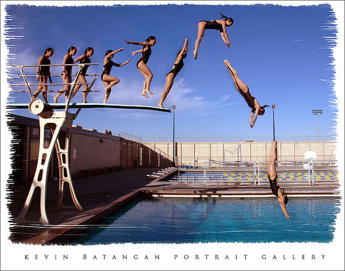
Artist- Kevin Batangan
Kevin Batangan takes images of different sports creating this work. This creates a moving effect in each of his images , as he captures each movement and puts them together in a sequence. This helps to support Kevin Batangans interest in learning photography ,where his images started from, as they were intended to be used to examine and critique by the athletes in the images.

|

|
|
I really like this image of Kevins because I think it captures a really interesting movement. The different shapes of the divers body are captured clearly and when put together I think creates a flowing image. The way he manages to capture each movement perfectly makes his images more interesting and allows the purpose of this images, for athletes to analyse their performance, to shine through.
|
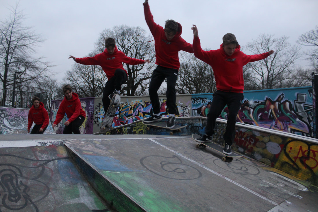
First development
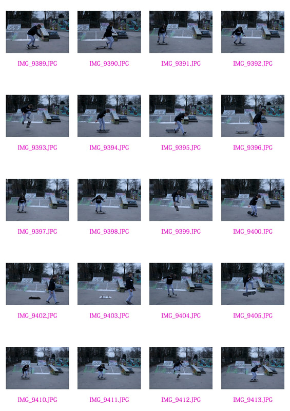
For my first development I went to Alexandra Palace Skate Park as I feel like the background really suited my compositions. I tried to capture tricks that gained height to allow my images to show a clear flow of movement. I photographed my subject with a very quick shutter speed which allowed me to capture each position.
|
|


WWW- I think I managed to capture a good development of movement in my images, I liked beginning to play around with different colours and backgrounds to make my compositions more interesting and I want to bring this into my further developments. I managed my shutter speed well and used a tripod to prevent camera shake. I also think that unlike my first development the background here relates more to the skating which helps highlight the movement.
EBI - Next time I will blend the feet into the background so the composition looks more natural. I will also experiment with different positions of the camera - for instance going lower to capture a different perspective.
EBI - Next time I will blend the feet into the background so the composition looks more natural. I will also experiment with different positions of the camera - for instance going lower to capture a different perspective.
Second development
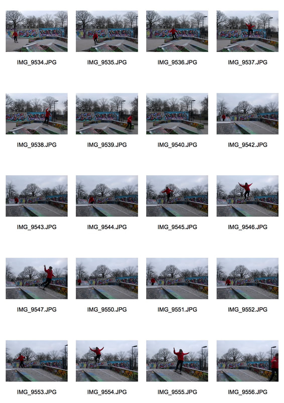
For my second development I want to show different tricks from different angles and experiment with changing opacity to blend each movement together more seamlessly.
|
|
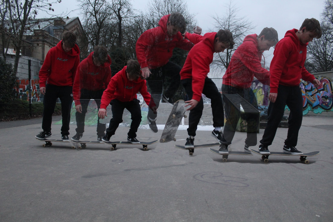
WWW- The subject I chose to photograph suited the theme as I was able to capture the movement of a trick on the skateboard effectively. I managed the shutter speed better this time as I managed to get clearer images with less blur. I prioritised my shutter speed (increased it) to capture movement and avoid the blur of my images. My images express my intentions which were to capture the fluidity of the trick without the blur of some images. The vibrancy of my subjects clothing adds drama to the photograph.
EBI- In Photoshop when I was editing I haven't blending or added shadows to make it look like one image, this becomes very obvious around the skateboard so next time I think I need to focus of the shadowing and bending the images to make them more seamless.
EBI- In Photoshop when I was editing I haven't blending or added shadows to make it look like one image, this becomes very obvious around the skateboard so next time I think I need to focus of the shadowing and bending the images to make them more seamless.
Artist and Me: Kevin Batangan
Batangan's work shows a clear progression of the diver moving along the board and into the water, I think I captured a similar effect in my composition of the skateboarder. Both mine and Batangan's work shows a difference in height during one point of the movement. I think this helps to make both the images more interesting. Batangan's image shows more of a progression and buildup whereas I didn't include as many images in my final piece. In my image I think the background distracts a lot from the image and I think if my model wasn't wearing a red jumper he would've been hidden amongst the background.

|

|
Third Development- Final development-Long exposure movement
For this final development I want to make my images more interesting and abstract. I want to take inspiration from Bill Wadman and Kevin Browar and to use slower shutter speed techniques to capture movement in a different way than I have been doing previously.
Ken Browar

Ken Browar is a fashion and beauty photographer whose work has appeared in Vogue, Elle, Marie Claire, and many other magazines. His passion for dance began when he lived in Paris and photographed dancers for the Paris Opera Ballet. One of his recent dance work was in collaboration with Deborah Ory, the NYC Dance Project is a collaboration between Deborah and Ken, merging their experiences and creative passions to create of the dance community. The project is not only a collaboration between the photographers, but also with their subjects. Each shoot is prepared as though it were it's own dance production, with attention paid to every detail movement, lighting and the feeling of each photograph. I think his images are really effective. I really like the contrast between the green and dark background as I feel it really helps to capture the flowing fabric. The high quality of the dancer almost seems as though she is still when in reality she actually is moving. I think this way of capturing movement is very effective.
Bill Wadman
Bill Wadman is an American portrait photographer living in Brooklyn, New York. His images have been seen on the covers and pages of major publications . Bill's long-exposure 'Motion' project has been featured in magazines as well as on The Huffington Post. His work titled 'dancers in motion' uses long exposure to capture the movement of the dancers.

|
|
|
In this image Wadman creates a flow of movement of a dancer. The contrast between the bright red outfit and the dark background I think really makes the movement stand out even more. I really like how he layers the different stages of movement and still manages to create such a clear composition. Bill Wadman uses a slower shutter speed to create these waves created by the dancer. He uses similar techniques to light painters to create a similar effect but with people, I think he uses a strobe light with a continuous light source in a dark room so his images don't become to overexposed, this helps as without this light his images would have became to blurry and unrecognisable as a dancer movement. I think his images have a very abstract feel and really show how dancing can be projected in many different ways.
|
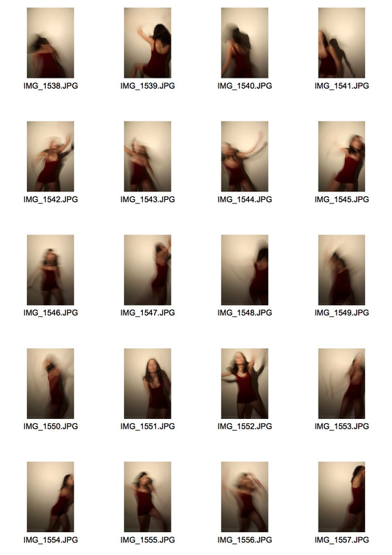
First Attempt-
In my attempts I was first trying to try and capture images in the style of Bill Wadman, I did this by photographing my sister infront of a plain wall on a long shutter speed to capture her dancing. I tried to make sure the room was dark so
|
|
|
WWW- I think my images capture her movement well and you can clearly see the traces of her previous movement whilst the image was being taken. I prioritised using a tripod as because I was using such a long shutter speed it was more prone to camera shake but I think I managed that quite well.
EBI- My images turned out very dark, I think that's because I was struggling to manage the iso and my shutter speed at a good combination so they didn't let to much light in and cause my images to become very over exposed. I also found it difficult to get the flow of movement as clear as Bill Wadman's images so next time I want to manage my lighting better alongside a quicker shutter speed.
EBI- My images turned out very dark, I think that's because I was struggling to manage the iso and my shutter speed at a good combination so they didn't let to much light in and cause my images to become very over exposed. I also found it difficult to get the flow of movement as clear as Bill Wadman's images so next time I want to manage my lighting better alongside a quicker shutter speed.
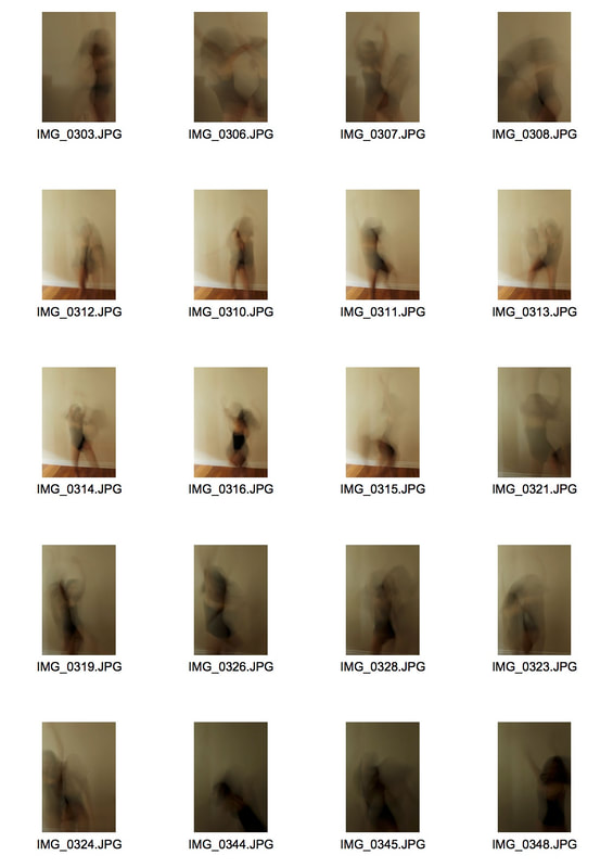
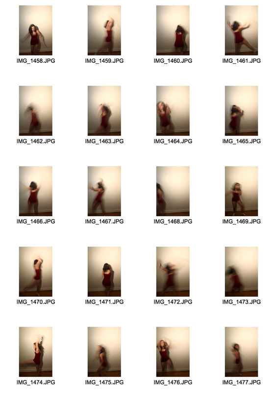
Second Attempt-
In my second attempt I planned to take a series of movement images and layer them over each others to create more interesting and flowing compositions, I used the same techniques as last time but decided to prioritise managing my lighting and shutter speed better to capture more of the movement. Once I had taken the images I then used photoshop to layer them over the top of each other and changing each opacity to 50% so each layer would come through. I also used changed to brightness to make sure each layer became seen properly.
|
|
|

|
|
WWW-I preferred these final images as I feel they express my intentions more I think they more clearly display movement. I also think I managed to focus on the lighting as these images are a lot brighter and you can see what is going on a lot more.
EBI- The layers get lost between each other, as I was placing them on top of the other each image was becoming lighter and lighter to the point where 3 layers was the most I could achieve successfully. I think this makes my compositions appear much more ghost like (Francessca Woodman) than my intentions of creating dance photography similar to Bill Wadman. Next time I want to try different techniques so I can successfully create the movement photography.
EBI- The layers get lost between each other, as I was placing them on top of the other each image was becoming lighter and lighter to the point where 3 layers was the most I could achieve successfully. I think this makes my compositions appear much more ghost like (Francessca Woodman) than my intentions of creating dance photography similar to Bill Wadman. Next time I want to try different techniques so I can successfully create the movement photography.
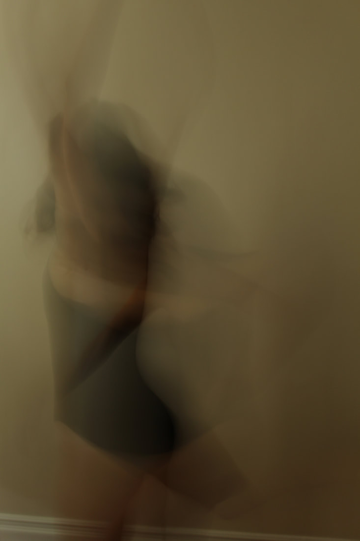
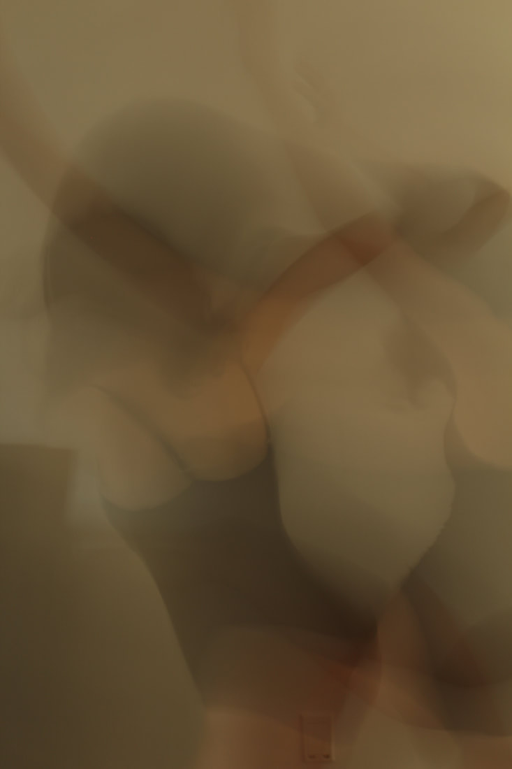
Third Attempt-
For my 3rd attempt I wanted to mainly focus on the editing of my images to make each image of the movement stand out more clearly under the layers. Instead of trying to layer lots of images onto one another I am going to focus on layer 1 or 2 to create a clearer composition.
|
|
|

WWW- I managed to get some blurred movement into my photos which was more successful than my other responses. I think the movements were also more abstract which is what I wanted to achieve in this experiment.
EBI- I am not still completely happy with these developments and I don't think they are giving me a good base to work on for my final exam piece. My images loose a lot of focus from the dancer and still look very ghost like , I also find it difficult when editing not to make the images underneath get lost. I think I want to continue working on dance movement but try and make the dancing stand out more as my aim of the images is to show how the dancer moves.
EBI- I am not still completely happy with these developments and I don't think they are giving me a good base to work on for my final exam piece. My images loose a lot of focus from the dancer and still look very ghost like , I also find it difficult when editing not to make the images underneath get lost. I think I want to continue working on dance movement but try and make the dancing stand out more as my aim of the images is to show how the dancer moves.
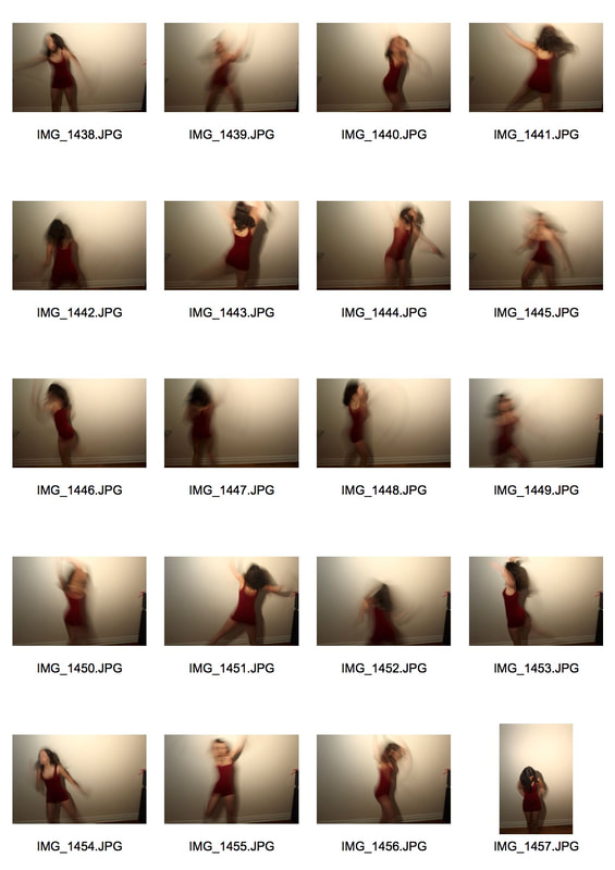
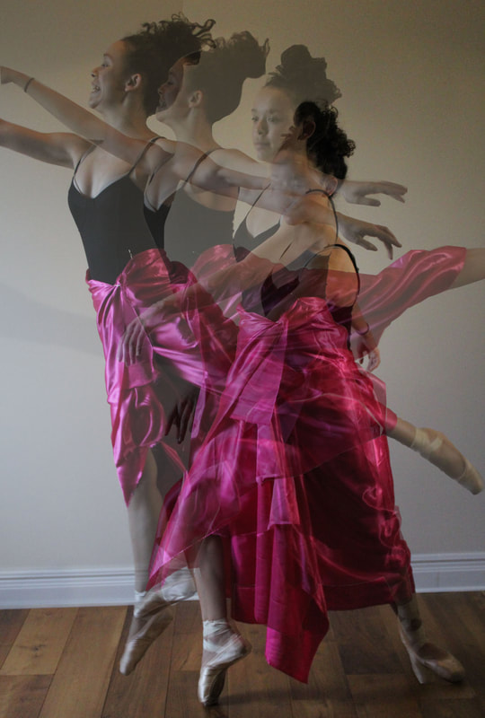
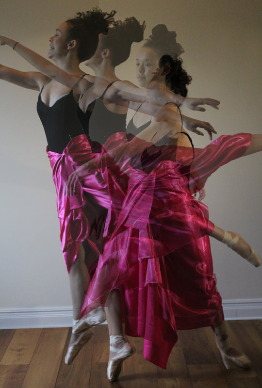
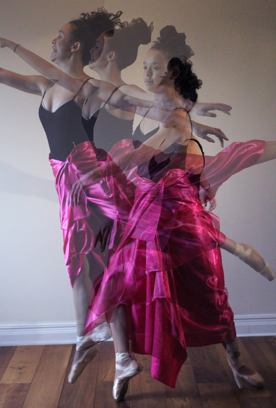
4th attempt- Long exposure people movement
For an experiment before my last development I wanted to focus on my editing and finding ways to not loose the layers amongst the brightness of the image placed on top. I used some of my old images of my sister to experiment, I began my layering only 3 or 4 different images and then using the eraser tool and the burn tool to highlight her face and the satin skirt. I think this was my most successful development and gave me an idea of how to create my final piece. I found the best way was to choose a focal point of the image and make that the part that stands out the most. For this image I chose the face and the skirt as I think they were the most striking parts of these images.

|
|
Artist and Me: Bill Wadman
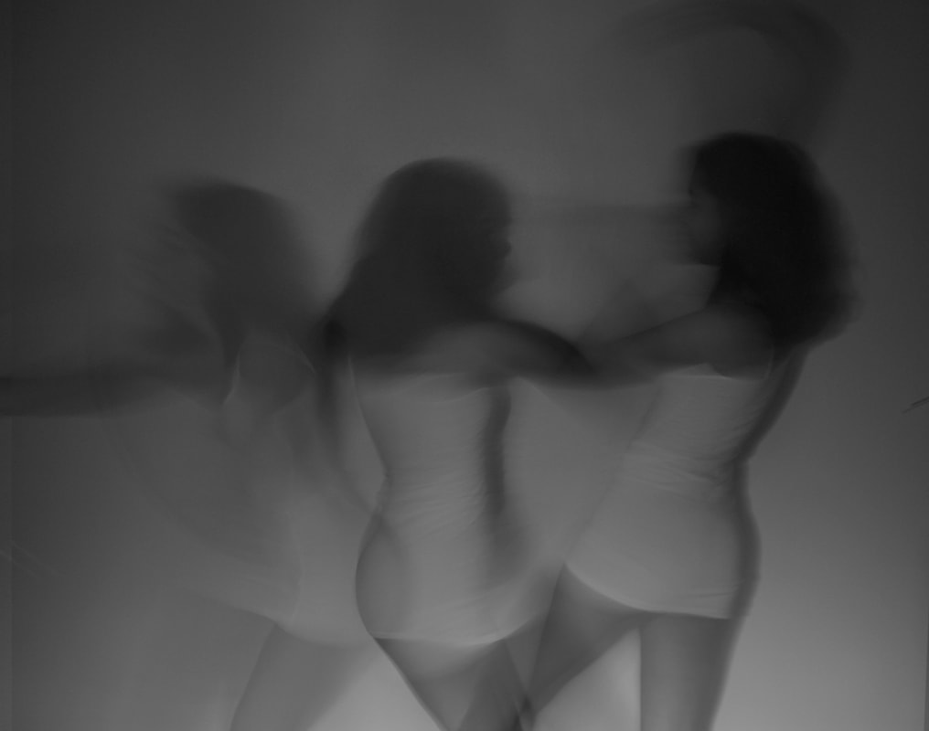
Bill Wadman and my response both show how a dancer moves and the shapes their bodies create. One similarity between our work is that the clothes our models are wearing give the image a more striking effect. the red leotard in Wadman's work brightens the image and contrasts nicely against the black background. In my image the shine of the satin skirt adds an effect of movement under the lights that I shone on the wall behind my model. In Wadman's work however he uses the complete body of his model whereas I didn't because I couldn't get a completely white background including the flooring and I didn't want the dark floor to distract my image. In Wadman'simage he has managed to create these long lines of flowing movement and almost use the dancers body to light paint the dance. In my image I found this hard and got little movement but I still think you get an overall movement effect.
|
|
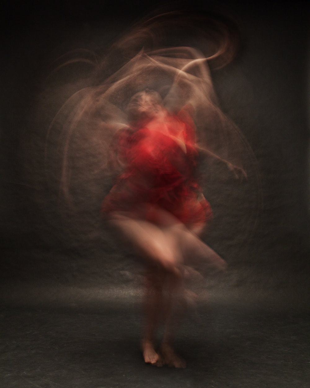
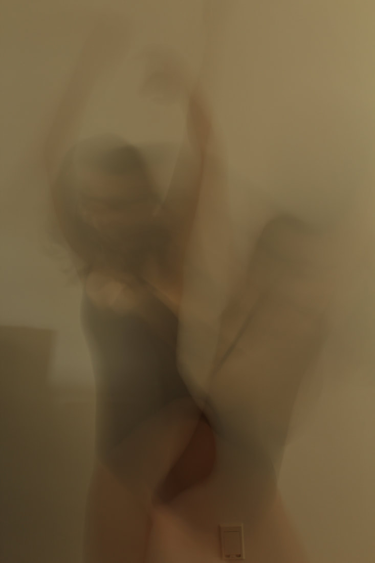
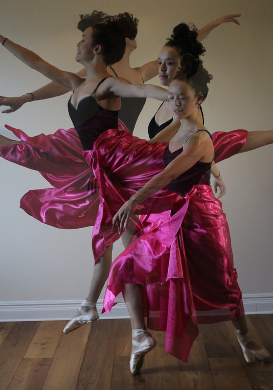
Final Piece- Inspiration
When I was researching dance photography I came along some of these images. I really liked the sense of natural movement in these images. I really like the fluidity of these images and how each movement flows seamlessly into the next. The fabric moving also creates a flowing effect and adds to the shapes of the dancer, the fabric also adds as a chain that connects each picture together. The dark background contrasts with the light coloured fabric which again makes the fabric and the movement of the dancer stand out even more. I want to keep this work in mind when I start my final response because I think I will be able to develop this more sucsessfully than the images by Bill Wadman.

Final Piece process
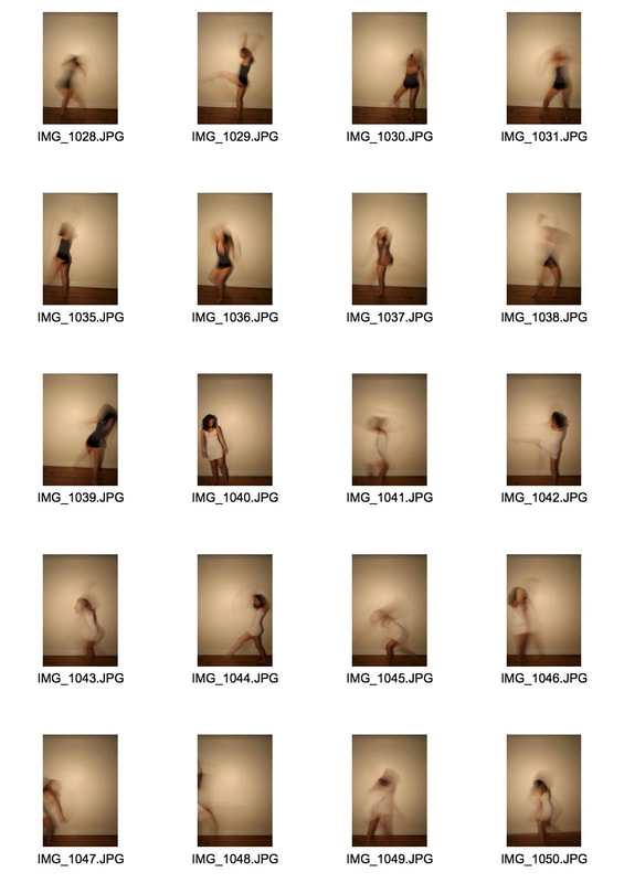
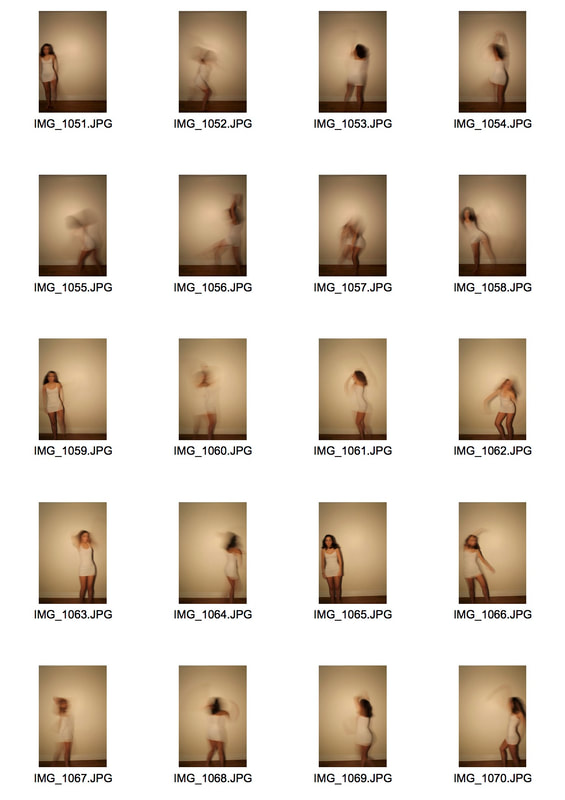
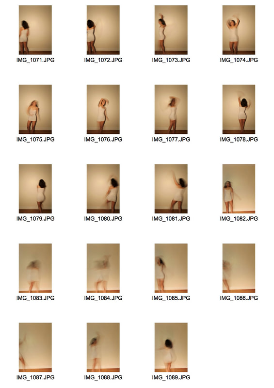
My intentions for my final piece were to show the process of a dancer and how this effects the shapes of their body and the clothes they are wearing. I chose a very vibrant satin skirt to highlight these movements as it gave really clear shapes.I decided to take pictures of another friend who is an actual ballet dancer as I felt this could give me a more professional response and whirl make my intentions to show the movement and process of a dancer more accurate.I wanted to take full vertical photos so it captured her ballet shoes swell which I think acted as another focal point of the image. When I begun editing I knew I wanted to focus on the skirt as it has such a vibrant coloured and creates really interesting shapes against her body when she was dancing. These were some of my experiments for my final piece:
|
|
|
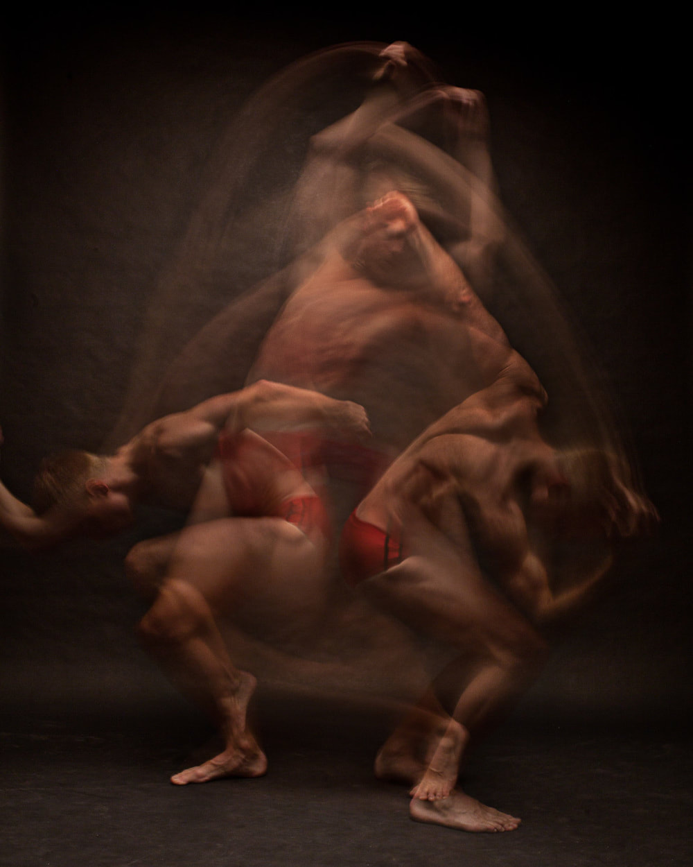
Final Piece - Exam (how I did it, print screens)
For my final piece I took 4 pictures of the dancer and cut them out using the quick selection tool. I then copied and pasted each layer onto each other and began to work out what layers I wanted to bring forward more. I placed around with the opacities and made sure each image fitted seamlessly together. I then used the eraser to make some features stand out more instead of being hidden behind the layer on top of it.
Final Piece - EXAM
This is my Final Piece for Force, I am really happy how it turned out and I think I managed to capture my intentions. It took me a while to perfect this image as I found it hard to find a good way to layer the images whilst keeping the skirt so vibrant. I wanted to create an effect of movement for the viewer and allow them to go deeper into a dancers movement and how they work. I do think I could've improved my images by finding a dance studio or stage to make my final piece look more professional but I found it hard to find a place to shoot that was accessible to me. I did find it difficult in this project to find the way I wanted to lay out my final piece but I think I tried hard and tried many different techniques. I did find that this end result gave me the clearest result of my intention to show the movement of the dancer.
|
|
